Neon Blockfall
A block-stacking game with its own neon identity, in closed testing on Google Play.
Developer and Graphic Designer
I design visual identities and build apps, games and websites, from the first stroke to the last line of code.
A block-stacking game with its own neon identity, in closed testing on Google Play.
The block game I played nonstop as a kid became the starting point for one I created.
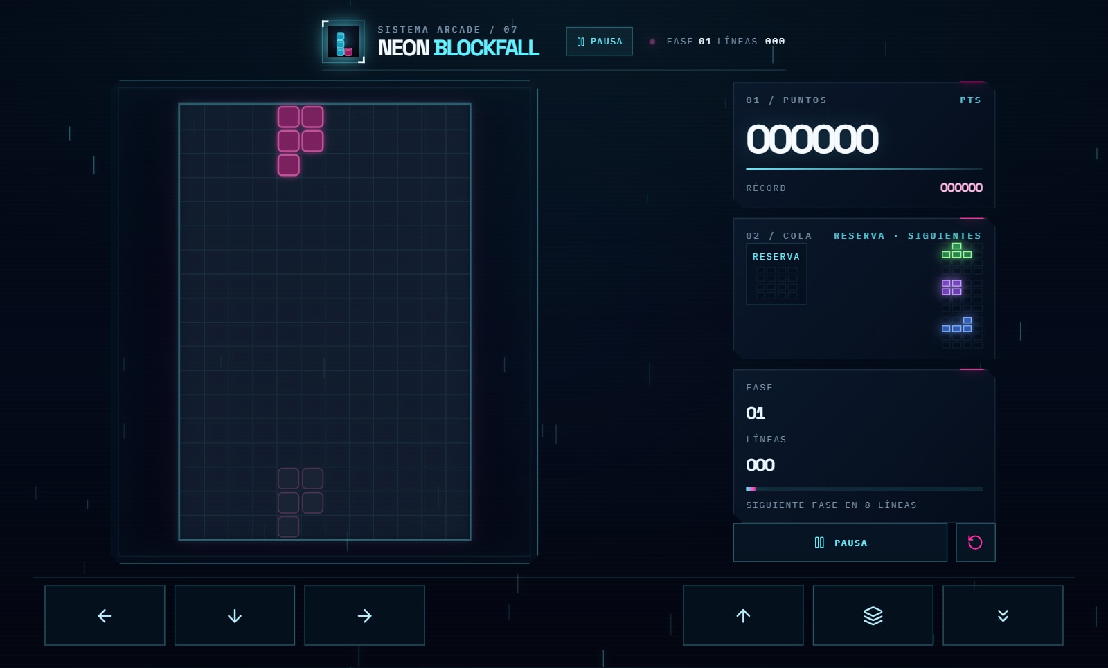
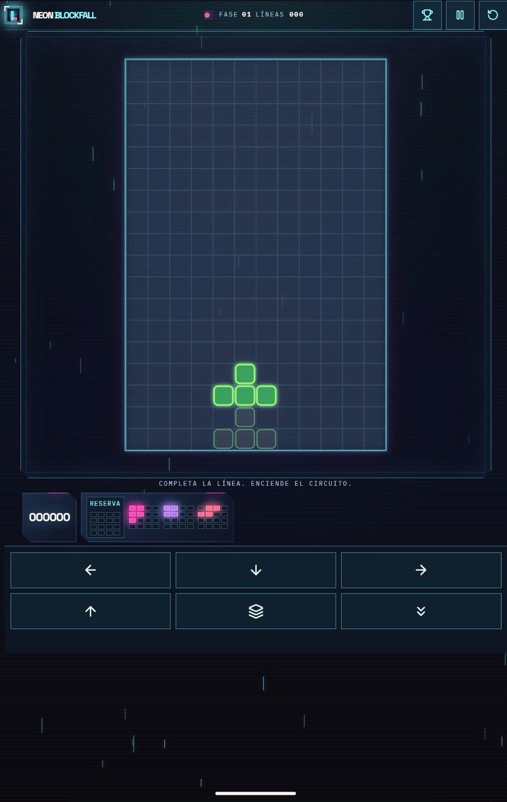
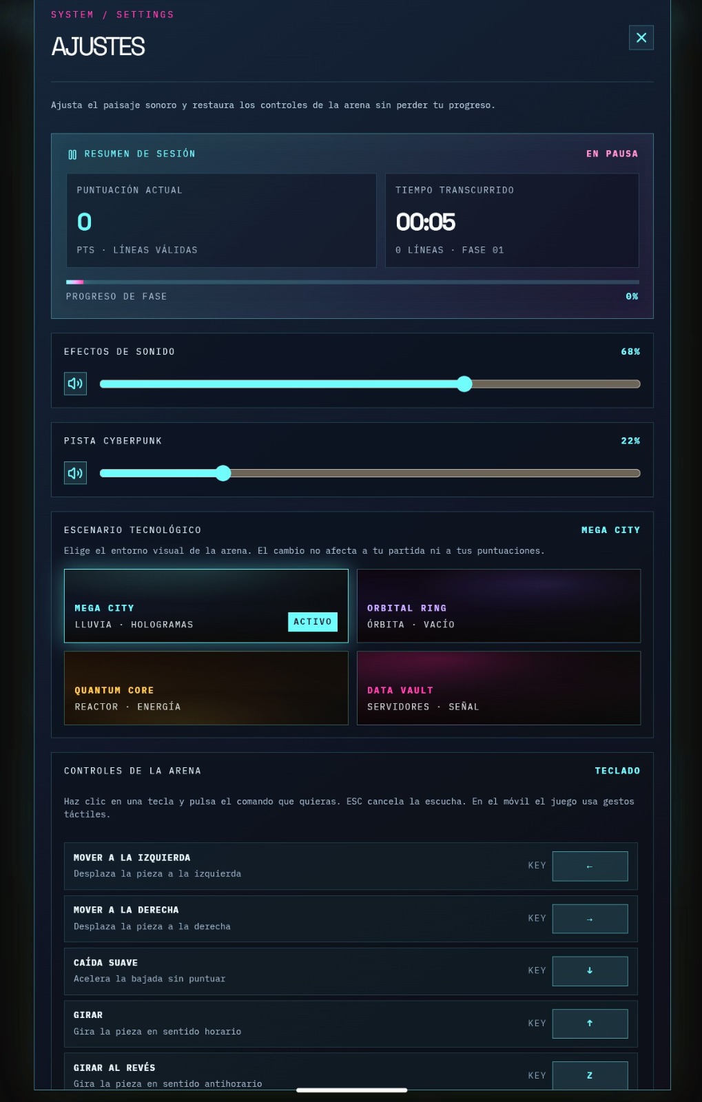
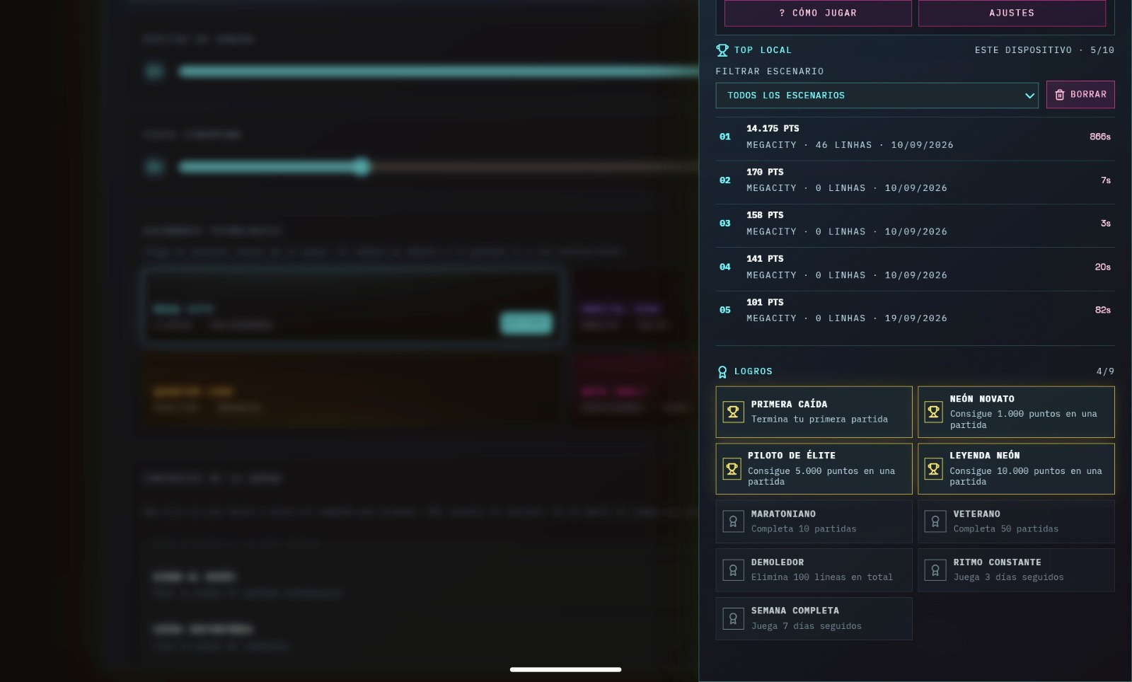
Real captures of the game, with the interface in Spanish.
What you see
Neon system
Near-black navy background, with cyan, magenta and gold as accents. Corner frames, monospaced uppercase labels and numbers in Space Grotesk.
Phases and scenarios
Four visual scenarios and a new phase every 8 lines. Modifiers (overload, pulse, blackout) alternate with calm phases.
Touch controls
Swipe to move, tap to rotate, swipe down to lock and swipe up to hold a piece. Six large buttons sit at the bottom of the screen.
How it is built, behind the screen
Pure TypeScript core
The game rules live in a module with no React, DOM or audio, so it can be tested in isolation with Vitest.
Serializable state
Game state is serializable: a match can be resumed when the app reopens, and the Daily Challenge uses a date-based deterministic sequence.
Delivery to Android
A web game packaged with Capacitor. The android/ folder is disposable: CI recreates it on every build and reapplies, by script, the changes the store requires.
Its own pieces, modes, scenarios and phase modifiers, without claiming to have invented the genre.
Attempted, not completed
I wanted an online ranking without building an account system. I tried Google Play Games and got stuck in the implementation. Today the game only has a local scoreboard.
An internal app for field work, supervision and administration at a pool maintenance company.
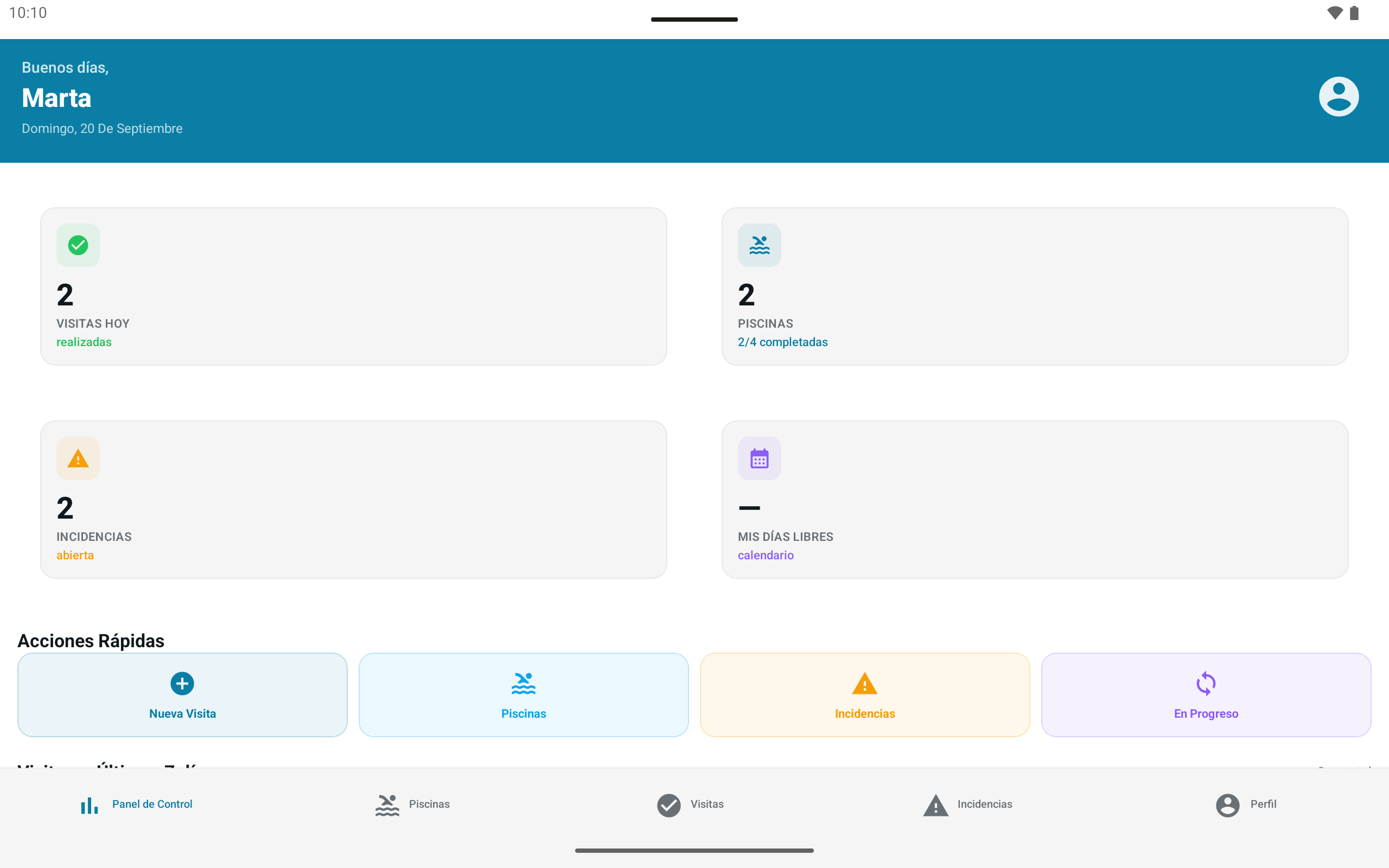
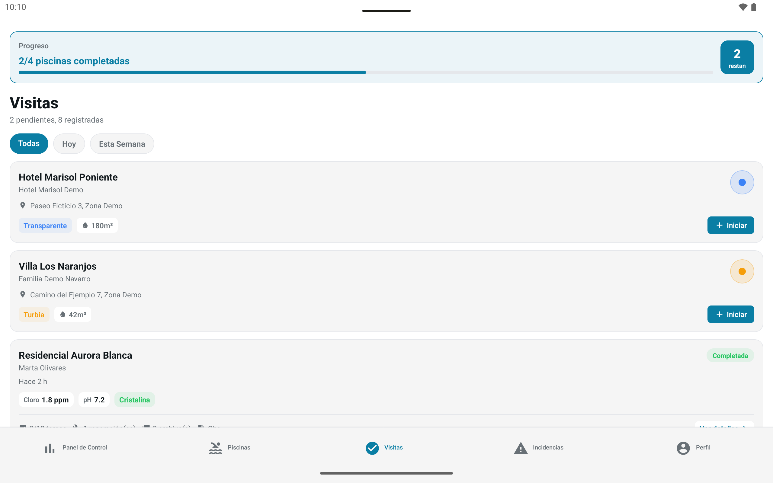
I did pool maintenance for Aguas y Oleocontrol, in Spain, and saw the work of many technicians pile up in WhatsApp groups. I designed and built an app of my own to replace them.
The technician follows the same path on every visit, and the draft stays saved on the device until the end.
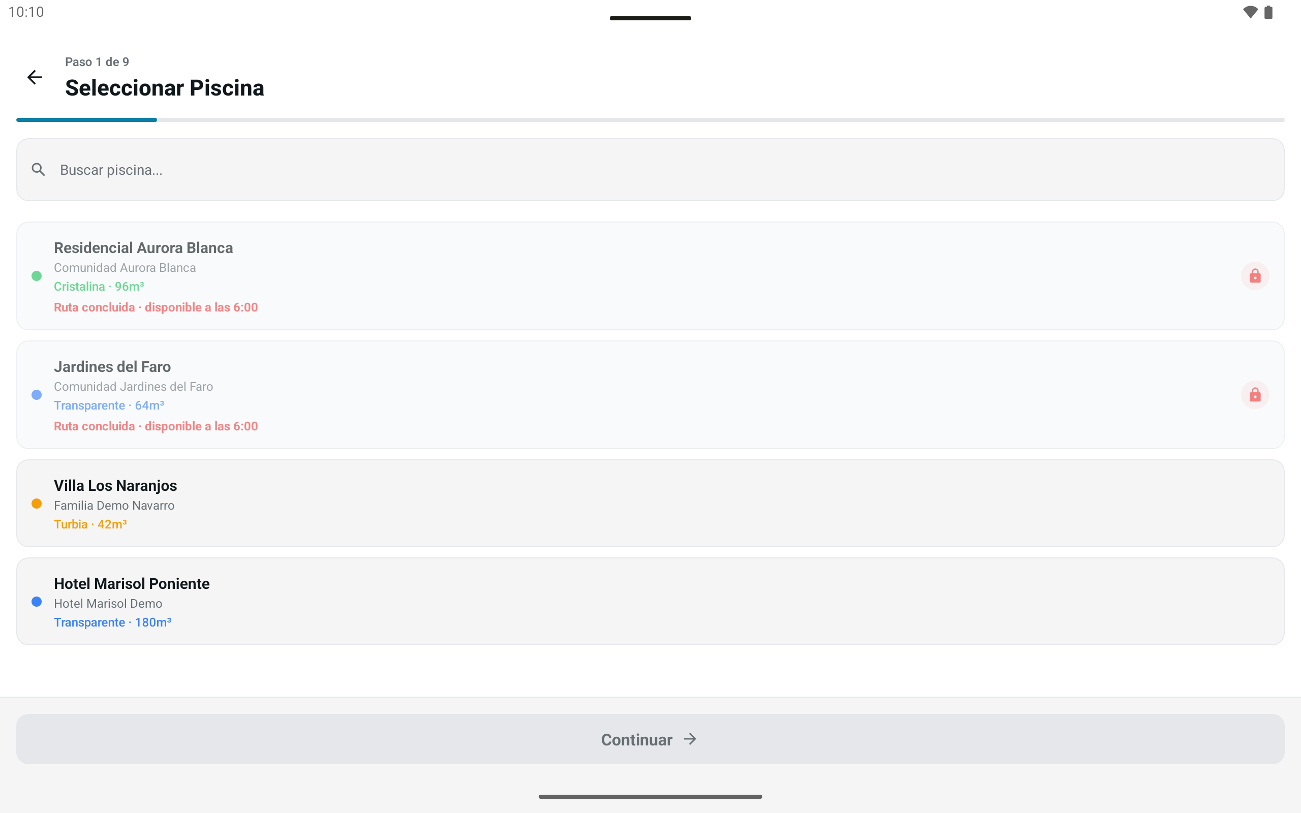
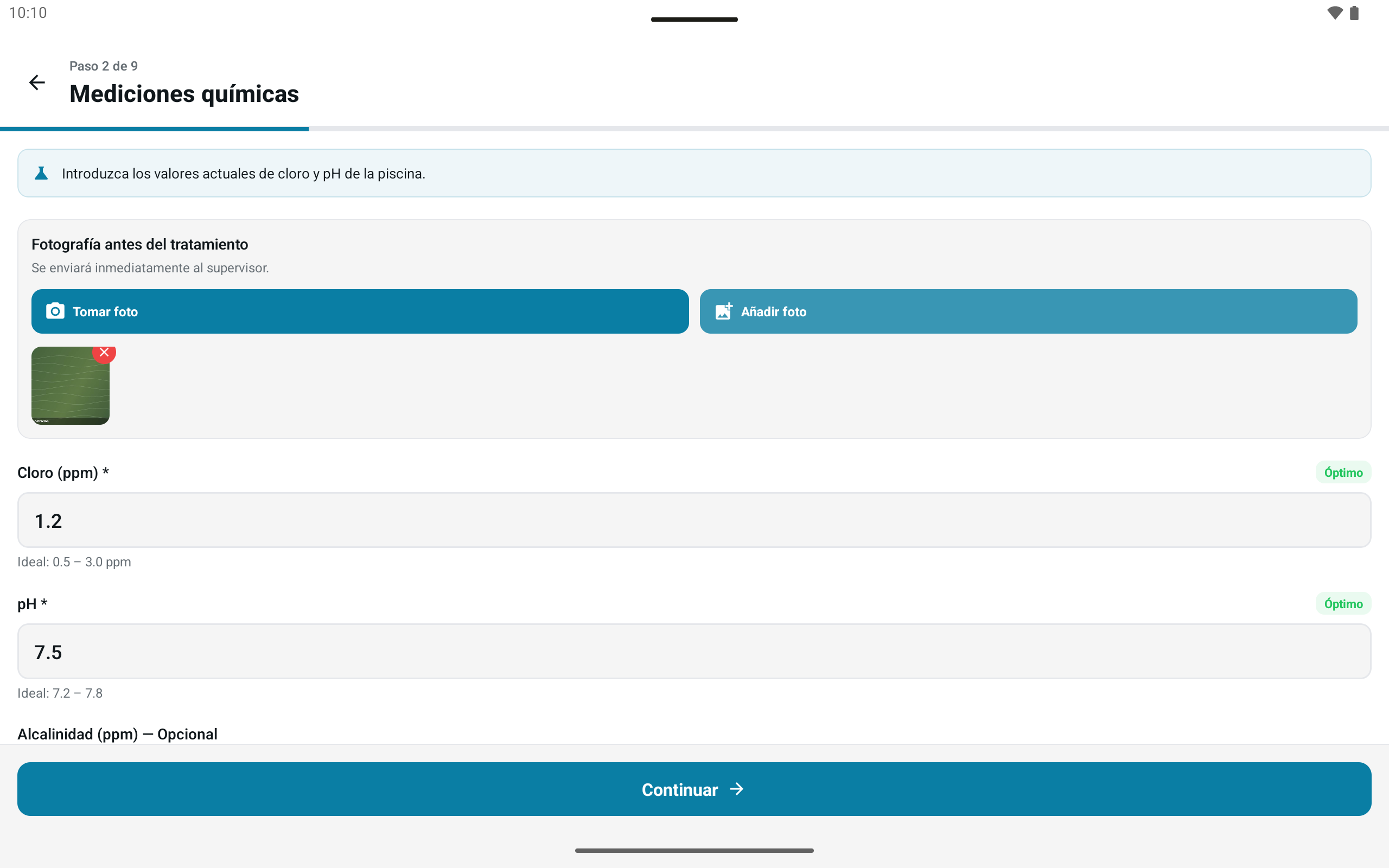
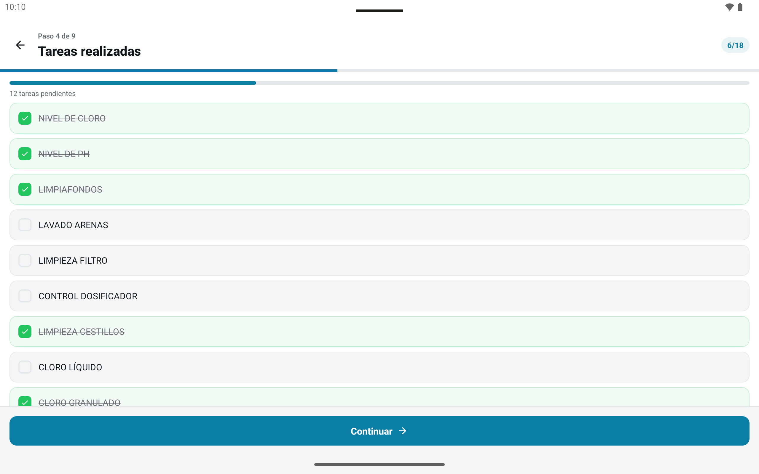
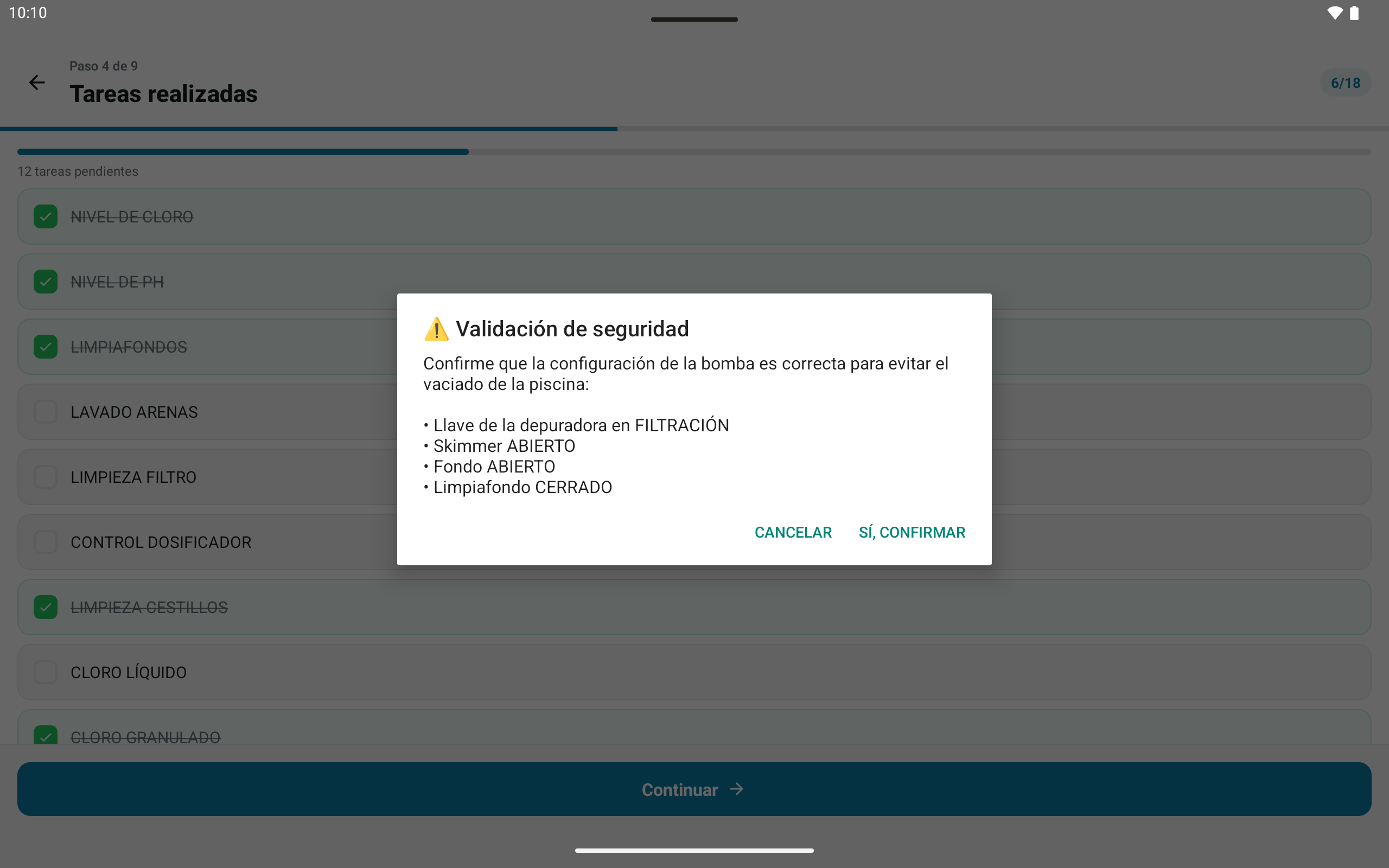
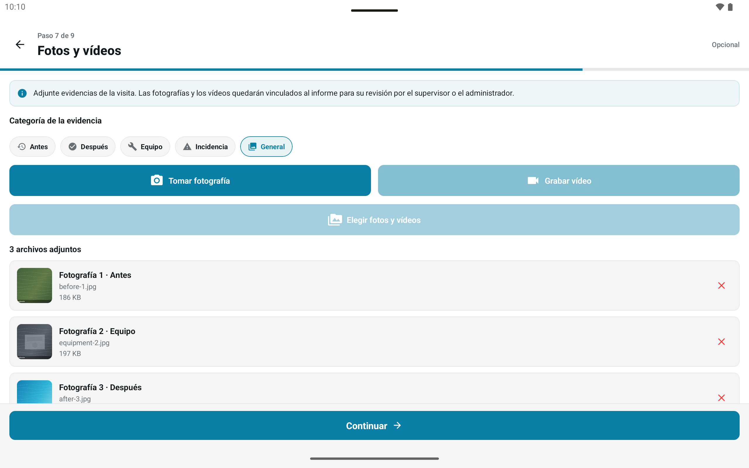
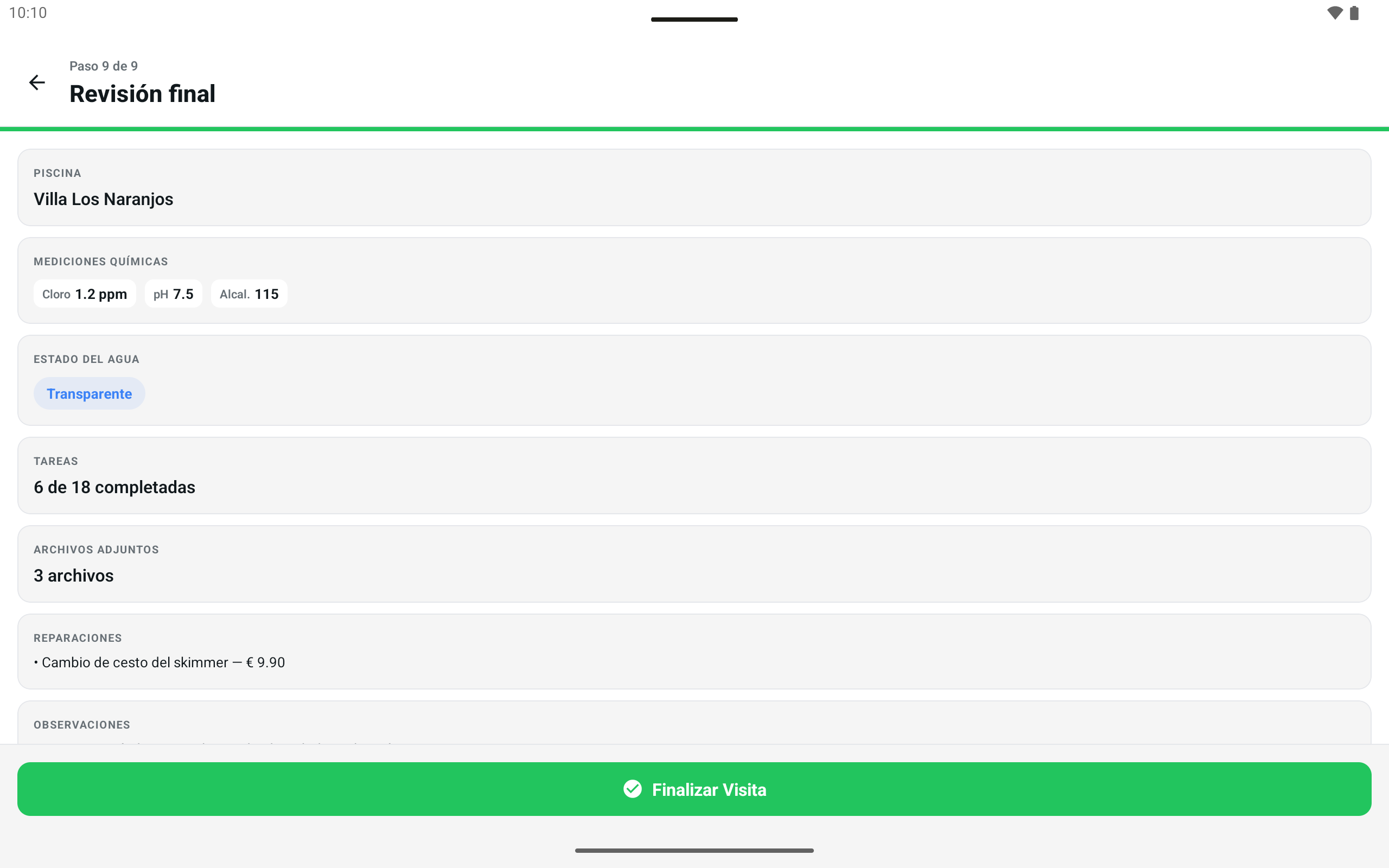
Step 1Picks the pool on the route. Pools already visited stay locked until 6 a.m.
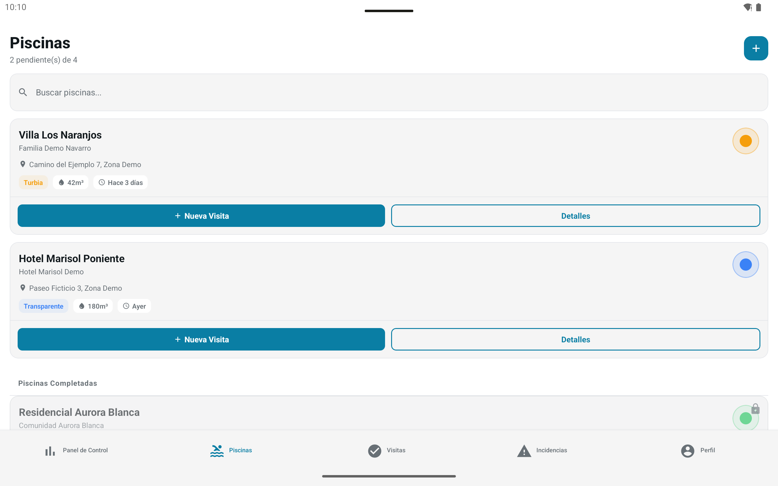
The day’s route, pools, visits and incidents.
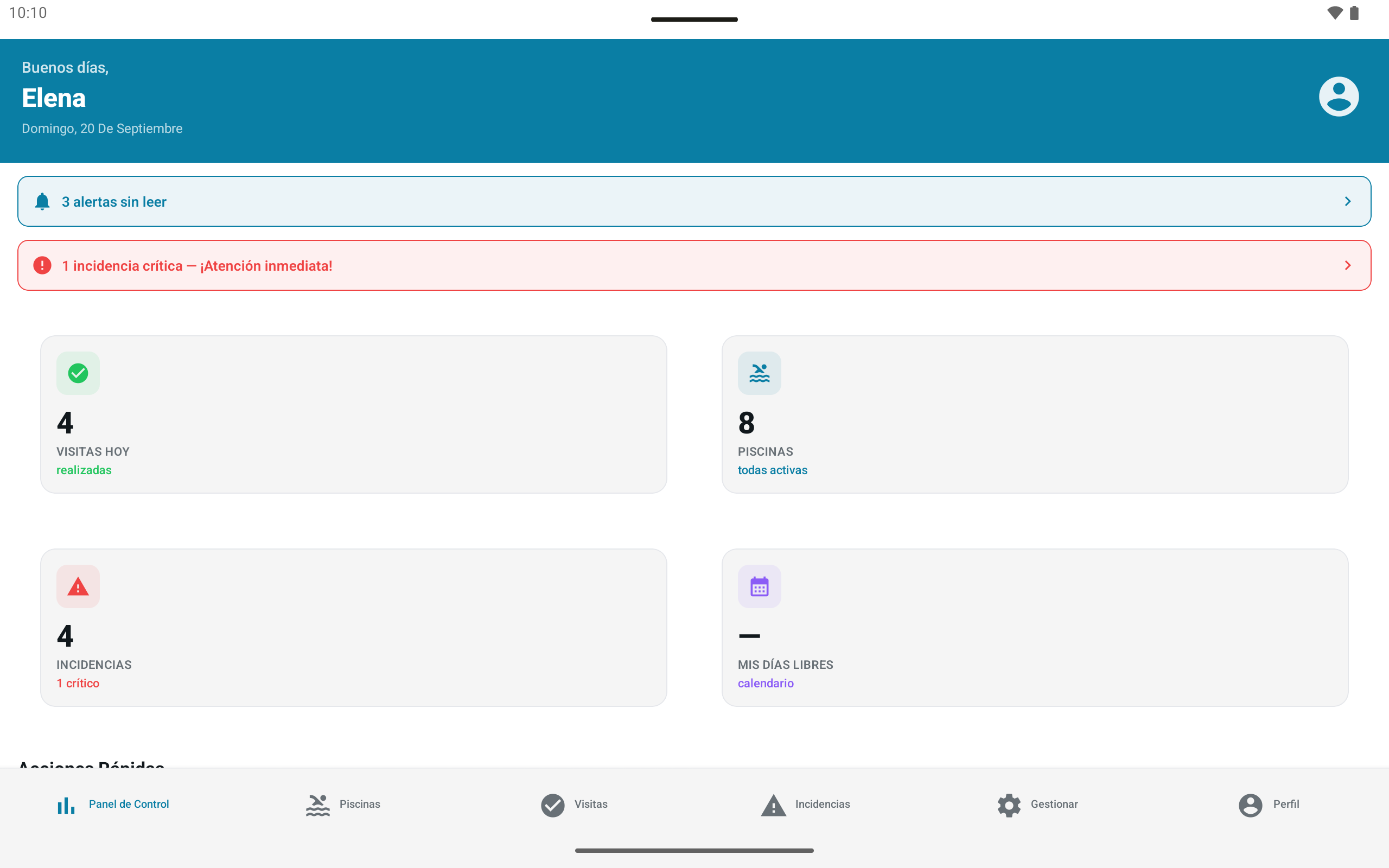
Alerts, critical incidents, resource management and reports.
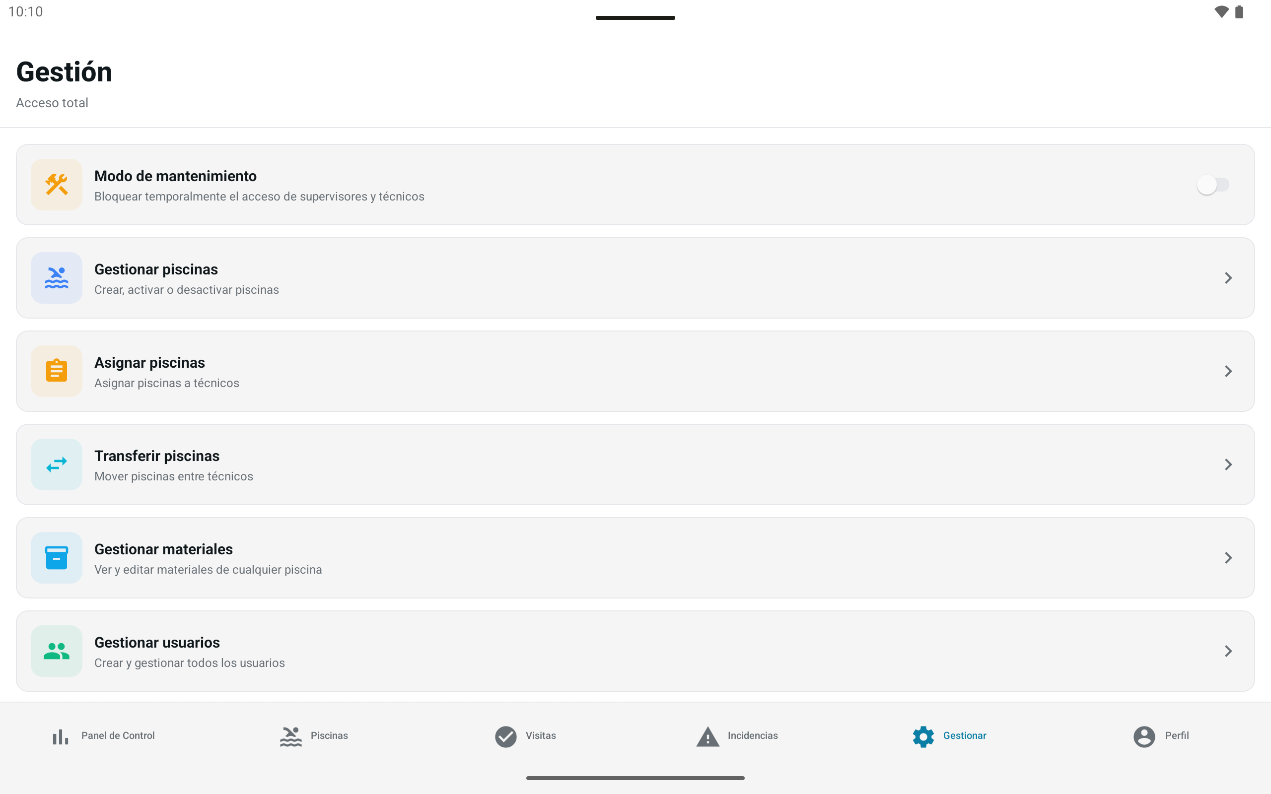
All of that, plus users, absences and maintenance mode.
In use since June 10, 2026, 7 days a week, about 12 operating hours a day, with 27 technicians. Figures I reported myself, not measured by analytics.
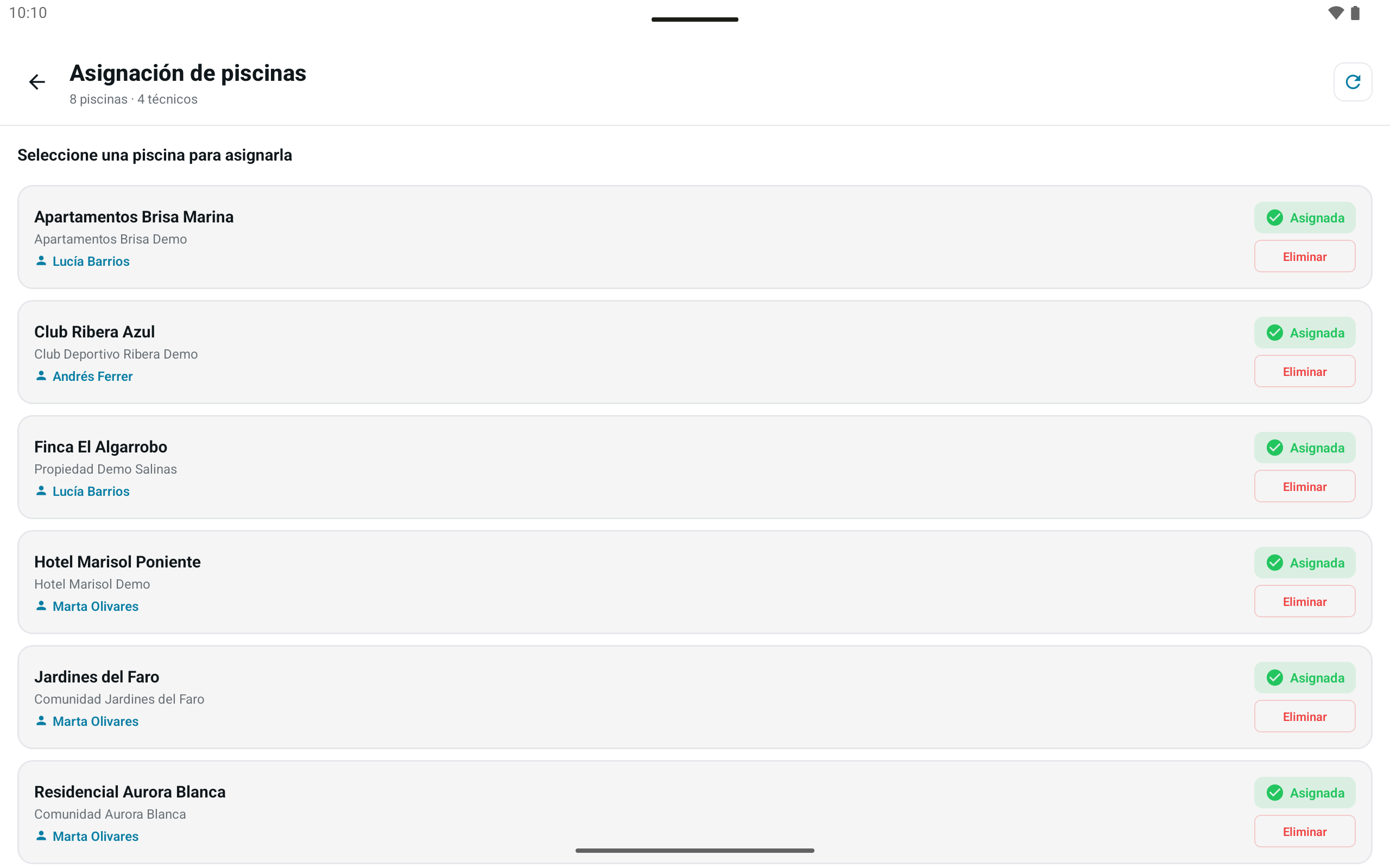
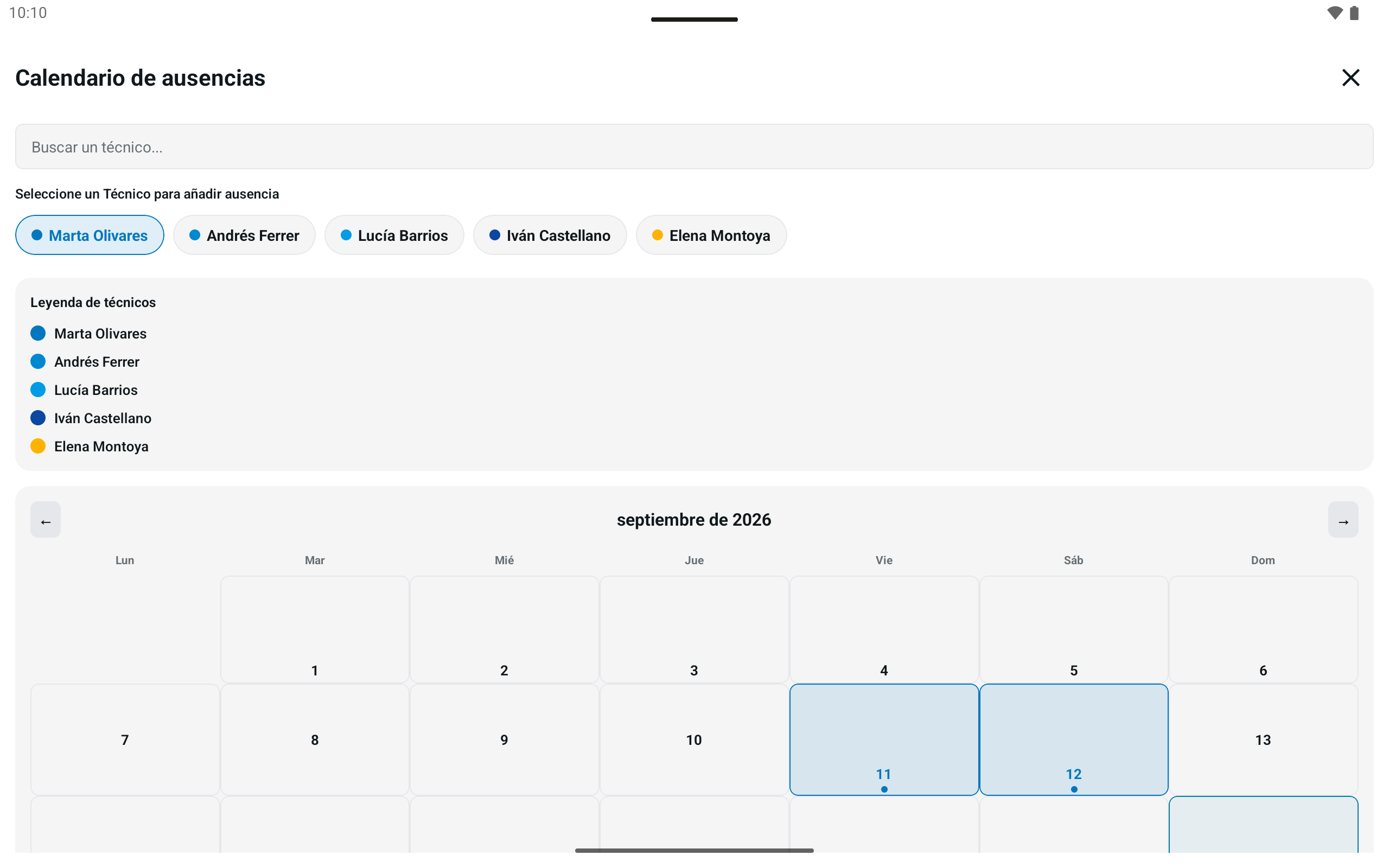
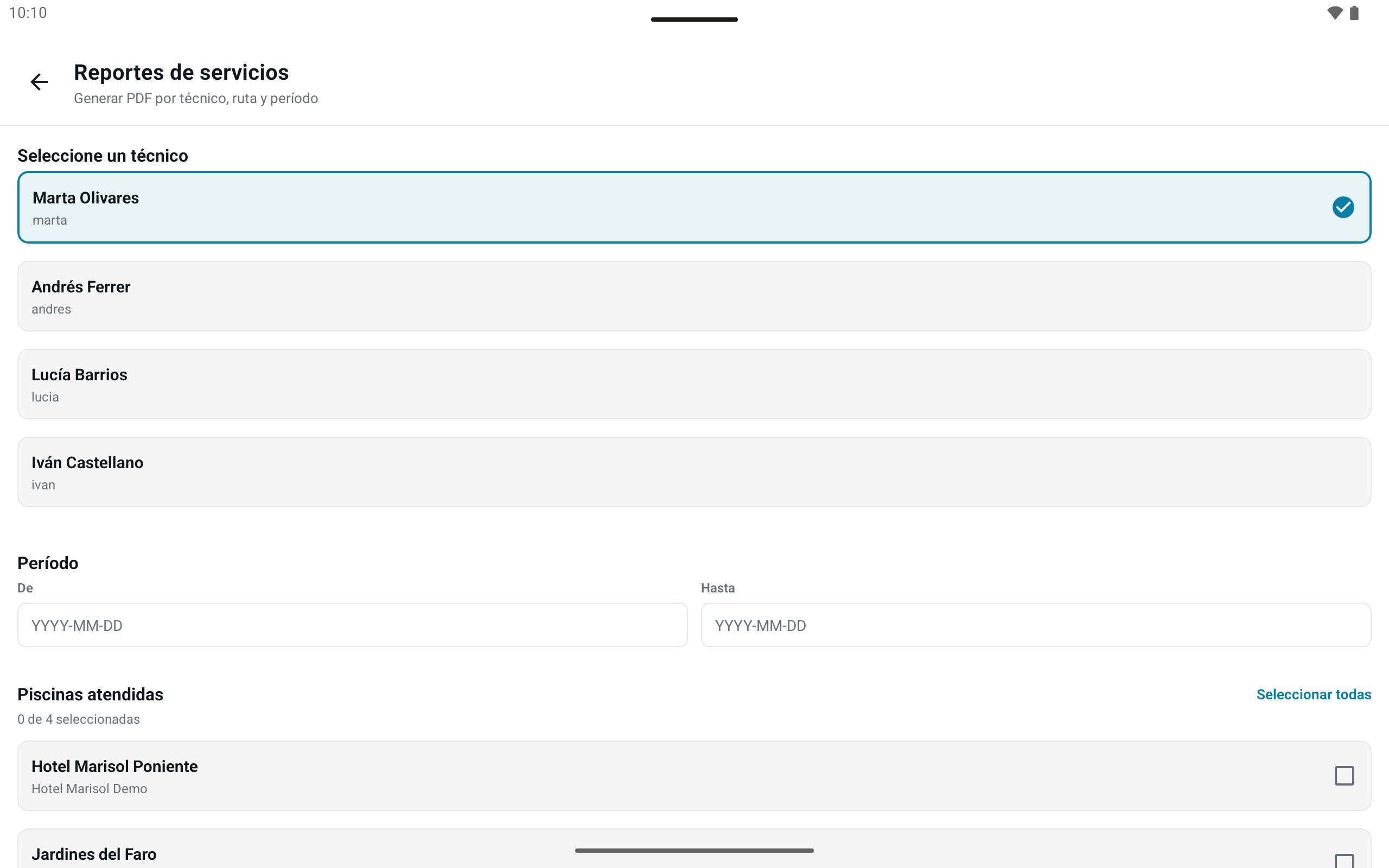
Pool assignment, absences, stock and PDF reports by technician, pools and period. The company used the reports for monthly operational control, the end-of-season report and to present information to clients.
Technicians worked with weak or no signal. The visit stays on the device and, once finished, goes into a queue that retries up to 3 times without duplicating it, with no screen of its own. If the retries run out, the item is marked as failed.
Who can see and change what is enforced in the database, by role, and access stays blocked until the mandatory password change.
Each technician signs in with their own account and the offline cache is separate per user. Routes, days off, pools, materials, visits, reports, photos and videos now live in one place.
I wasn’t paid for infrastructure costs and wanted to avoid a service that could bill me once past the free plan. That is why I moved from Firebase to Supabase.
Context: the Supabase free-plan storage was exceeded by the accumulation of photos and videos, and the service is restricted for now. The summer operation is planned to run until September 30, 2026.
This is a study of my work and of the product; it does not represent the company.

Name, logo and creative direction for a real handmade truffle business, with its own website.

I created the name, the logo concept and the creative direction for Feito Pela Bya, my daughter Marya Bheatrys’s handmade truffle business, and built the website.
The chocolate ribbon curls into the B of Bya. The bow closes the box, the truffles show what is inside and the script lettering signs it.
Deep plum, raspberry and cream, with fine gold details. Playfair Display for headings, DM Sans for text.
The apron, the ribbon-B, the flavor plaque and the brand card repeat across every scene.
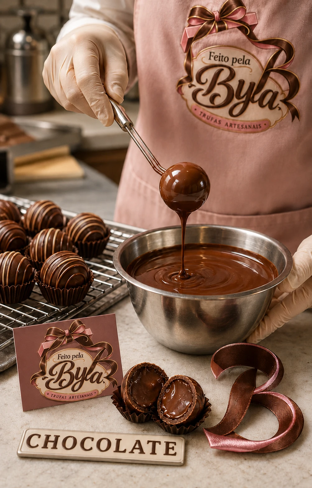
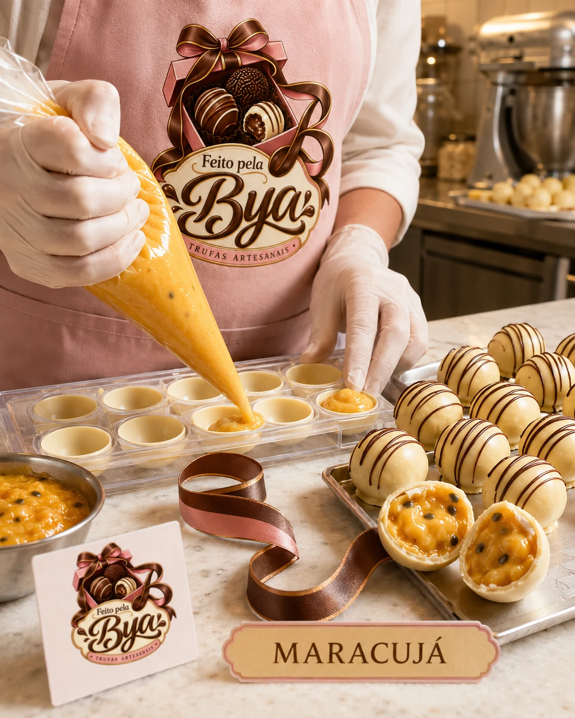
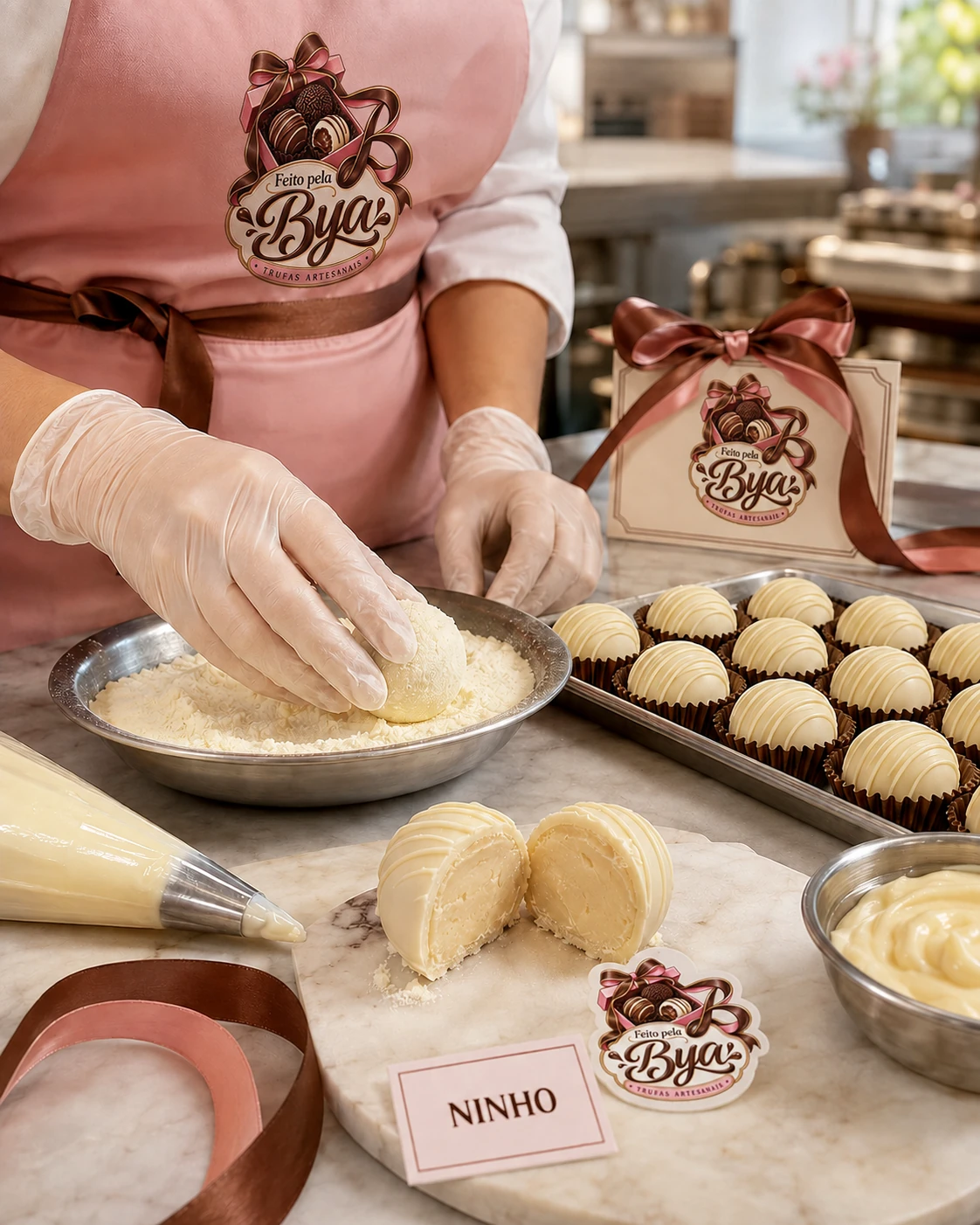
Same worktop, same ribbon, same apron.
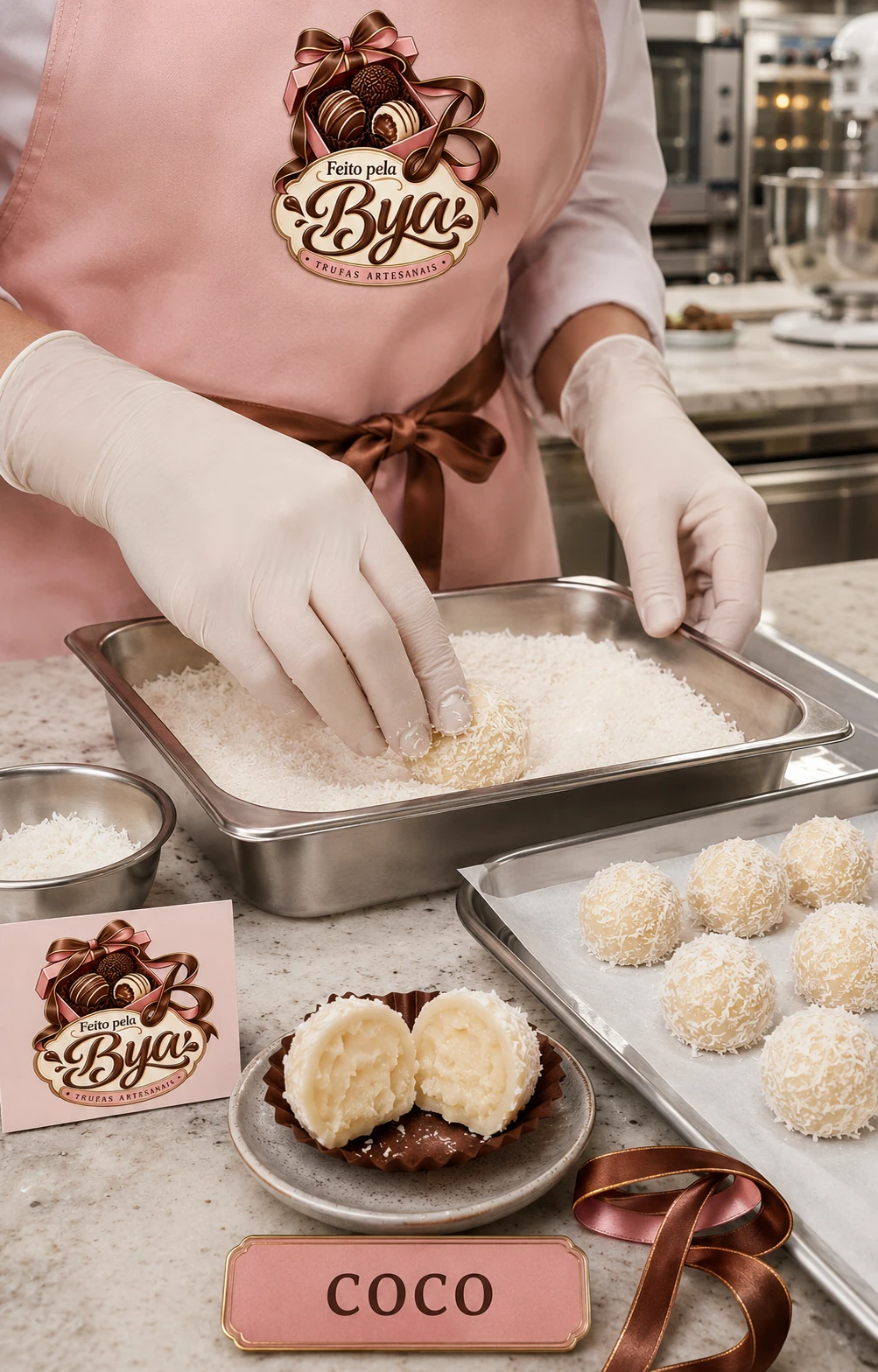
Product visuals created with AI assistance, under creative direction. They are not photographs.
In the product visuals, the logo appears on the apron and on the card, and the ribbon becomes the B.
Flavor plaques
The site uses the same palette and the same serif, and takes the order all the way to WhatsApp.
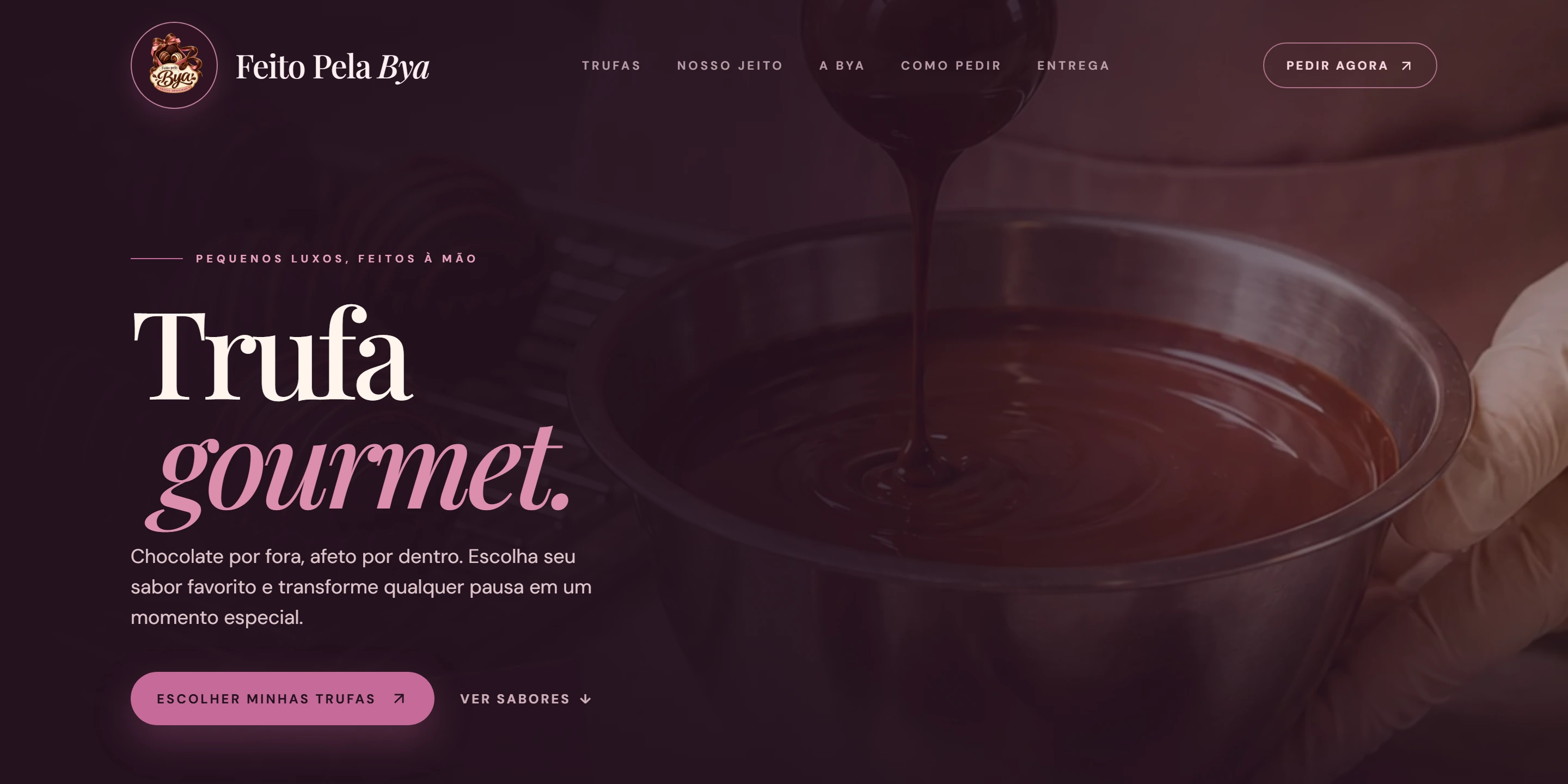
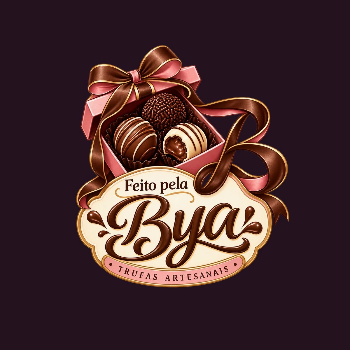
Feito Pela Bya is the brand and business of Marya Bheatrys, who also contributed ideas during development.
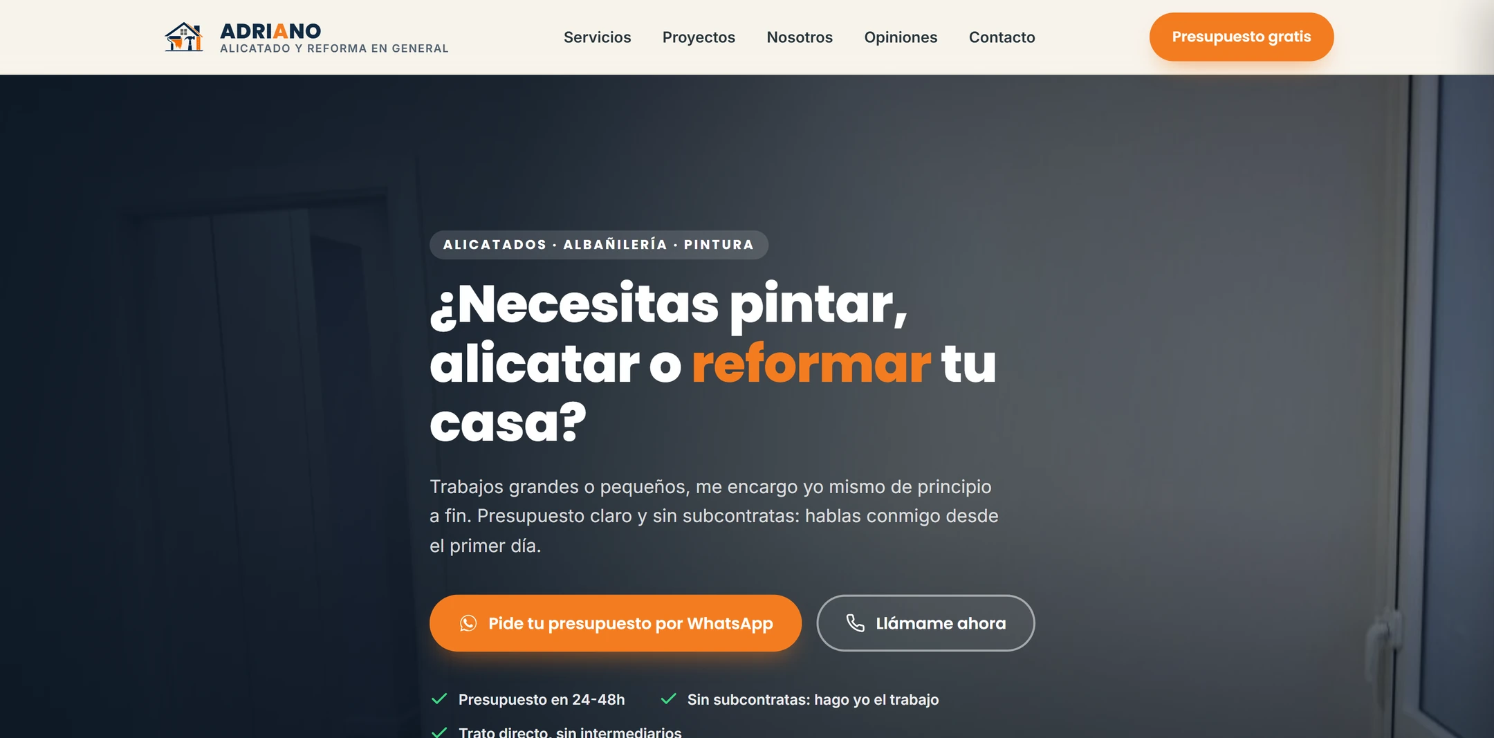
A landing page for Adriano’s renovation business in Vigo, Spain.
A real website for a renovation business in Vigo: built to take visitors to a quote request by WhatsApp or phone, with the work in plain sight.
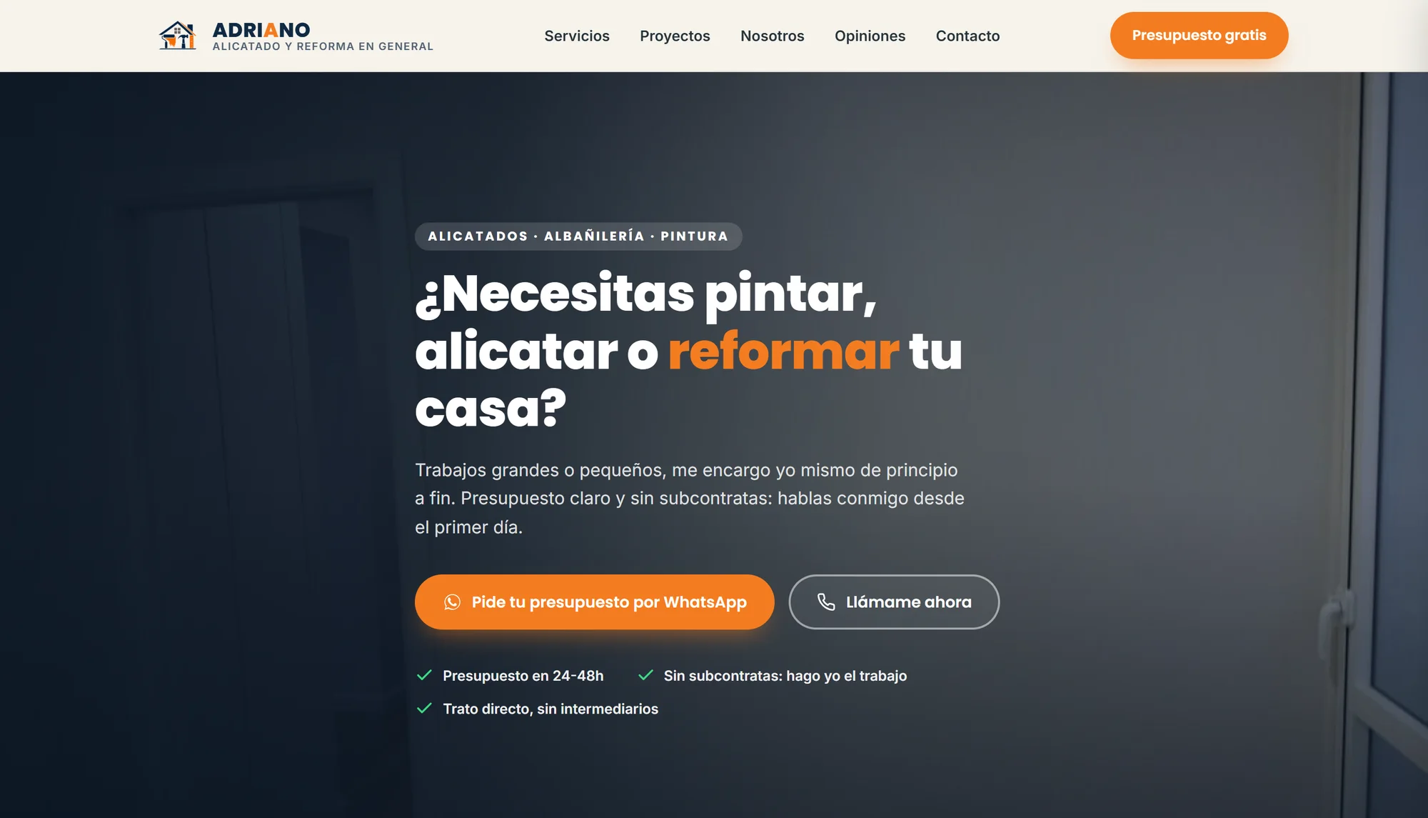
Adriano is a tiling and renovation professional in Vigo, Spain. The site is the business’s digital presence and the entry point for quote requests.
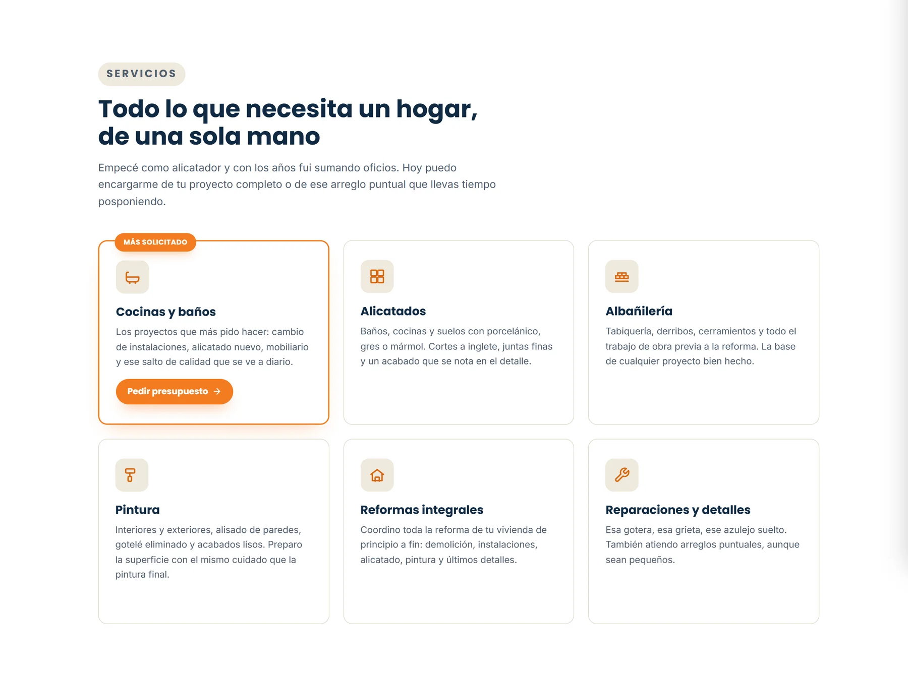
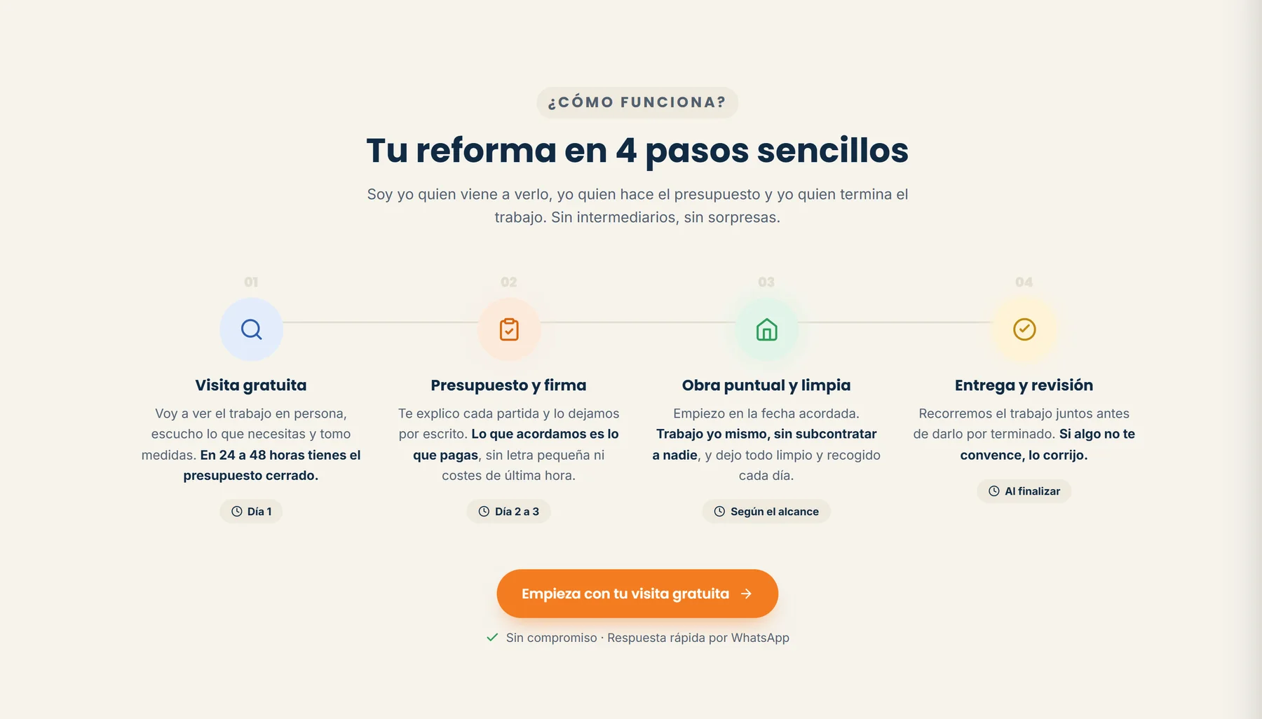
A single page organised like a quote conversation: what he does, how he works, what he has done and how to reach him.
Opening, services, how it works, projects, about the professional, commitment, service area, reviews and contact.
The gallery shows 24 real photos of jobs, organised by type, in a column grid. Each photo opens enlarged, with a caption.
Six filters: all, kitchens, bathrooms, renovations, exterior and “before starting”.
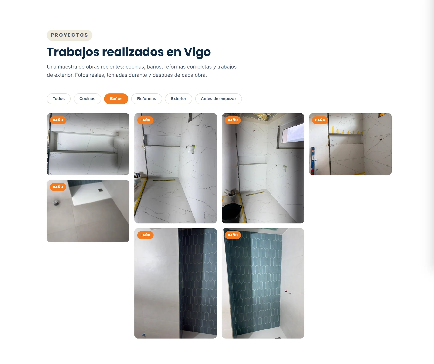
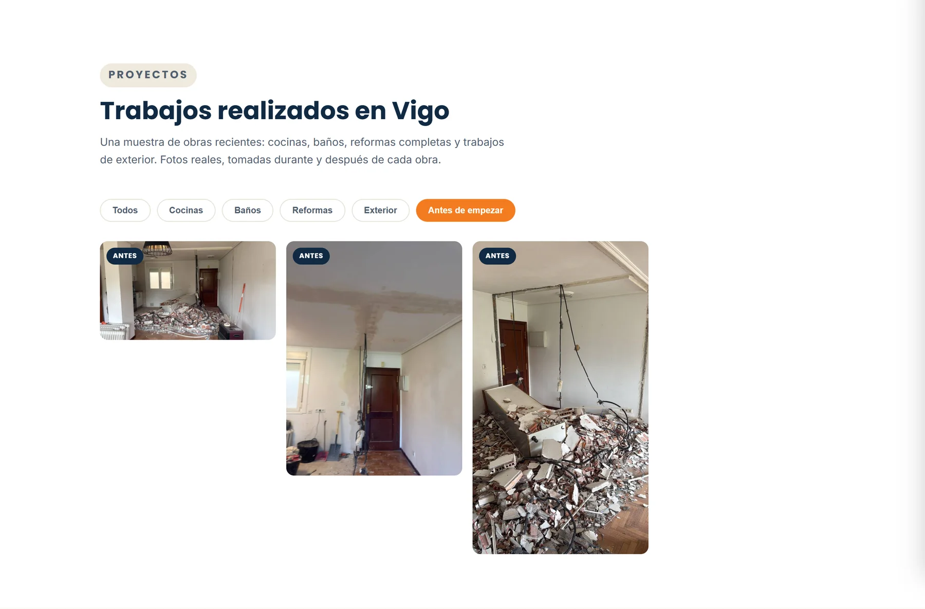
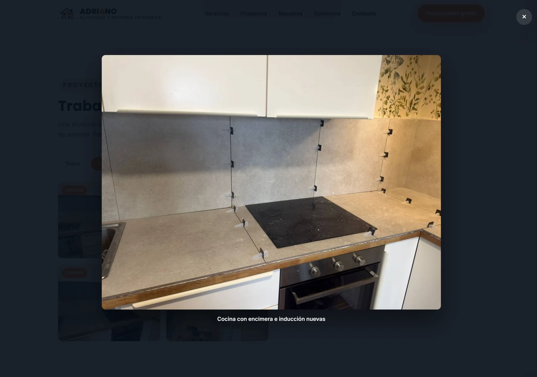
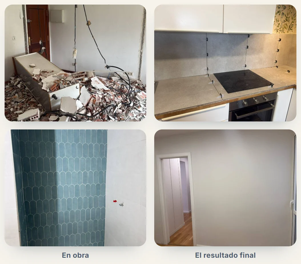
Only interior photos appear here. The few facade and street photos on the site were not used in this case, to protect clients’ privacy.
The path to contact is the same across the page: a WhatsApp button, almost always with the message already written, and a link to call.
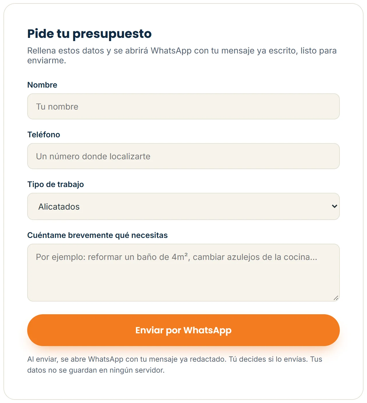
What the site declares so search engines and social networks read it as a local renovation business in Vigo.
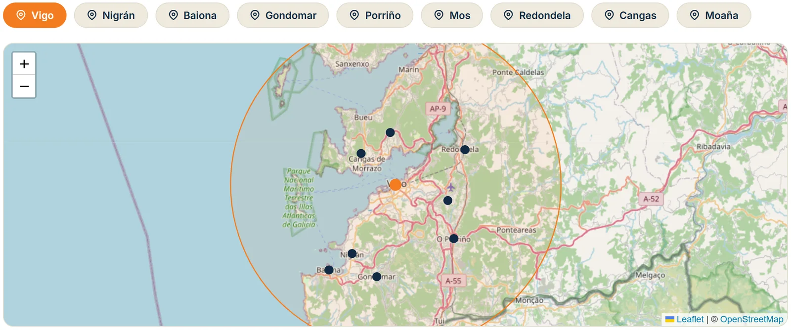
This case describes the structure. There are no ranking, traffic or conversion measurements, so no result is claimed.
HTML, CSS and JavaScript; Python for the builds; Leaflet with OpenStreetMap; Poppins, Inter and Caveat fonts via Google Fonts; hosted on Vercel and served on the client’s own domains, adrianoreformas.com and adrianoreformas.es.
The same site reorganises below 640 px: a side menu, a two-column gallery and the fixed contact bar.
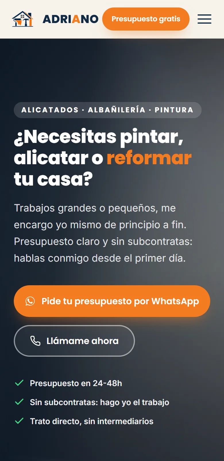
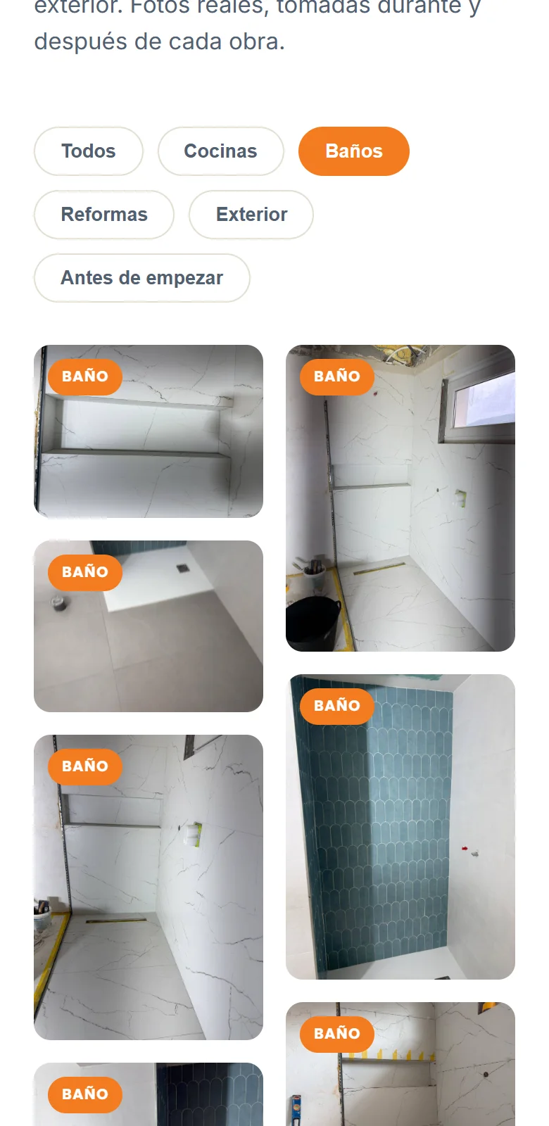
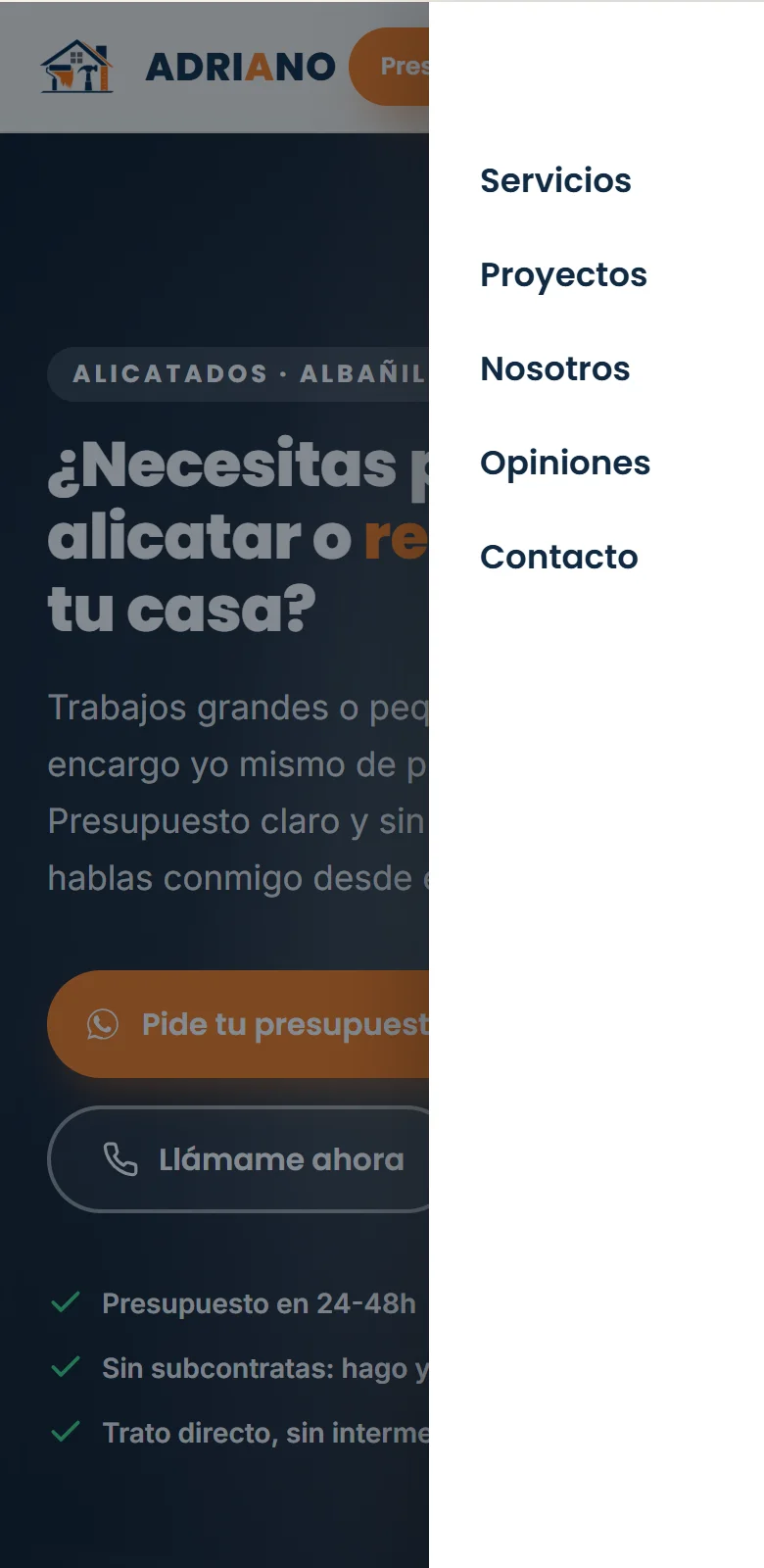
Real captures of the published site, with an emulated phone screen. The fixed bar is in a separate capture, taken in a 390 px window.
Job photos taken on a phone are heavy; here they arrive light and only when needed.
The site’s photos are resized and light (the repository does not include the step that reduced them). Live, the gallery’s 24 use lazy loading (loading="lazy"), the map waits until it is near the screen and the deploy version references the photos as files instead of embedding them in the HTML.
There are no business figures, customer reviews or search or conversion results in this case: the site does not measure them and nothing here invents them. The case also shows no client contact details.
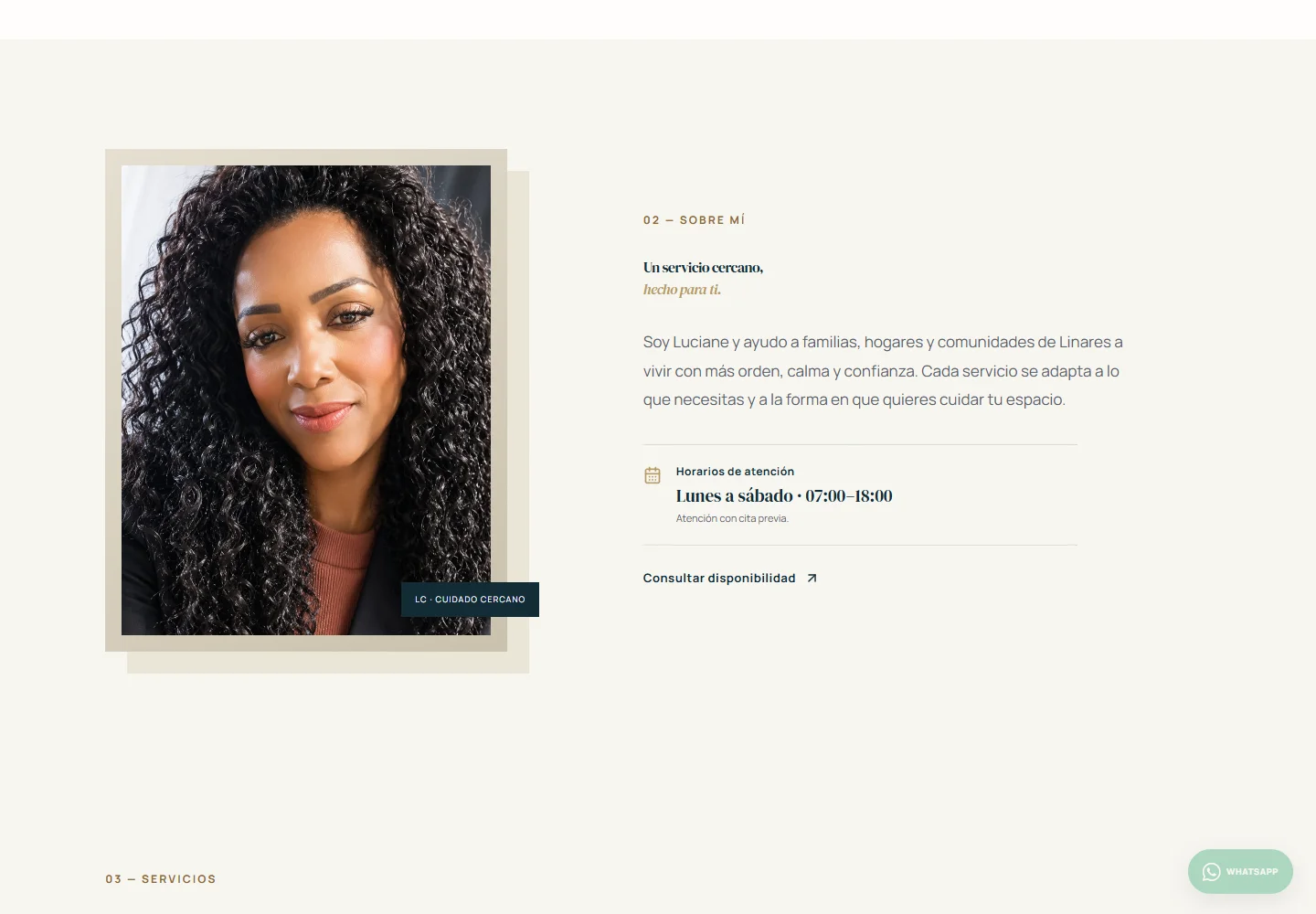
A cleaning and home-care service website in Linares, Spain, with moderated testimonials and its own Cloudflare backend.
A real website for a cleaning and home-care service in Linares, Spain: services, packages and testimonials, with its own Cloudflare backend for moderation and visits.
Luciane offers home cleaning and care services in Linares. The site is the business's digital presence: it presents the services clearly and gives visitors a direct path to contact through WhatsApp.
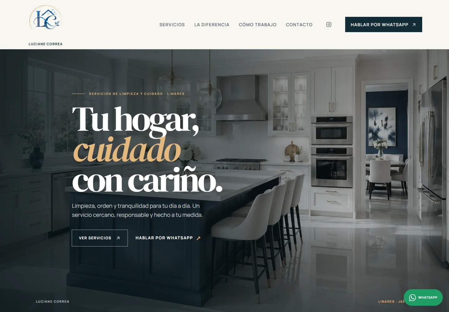
The identity documented in the project itself (ideas.md, written before implementation): editorial, restrained, with deep navy as the signature color.
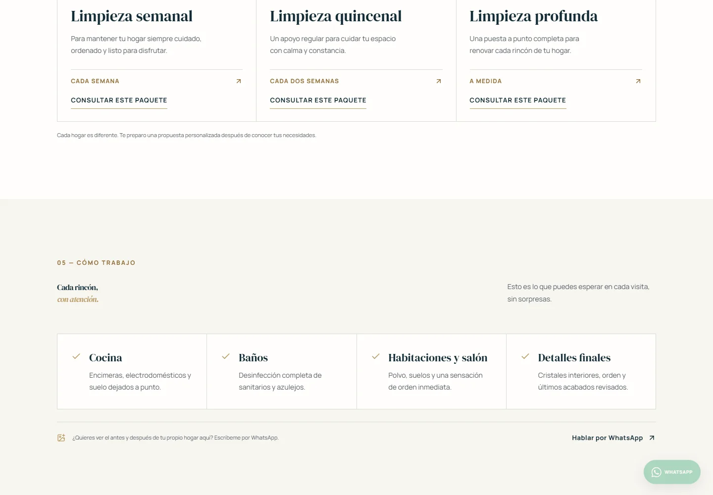
The offer splits into two levels: five individual services (home and common-area cleaning, ironing, pet and child care) and three recurring packages (weekly, biweekly, or a deep clean).
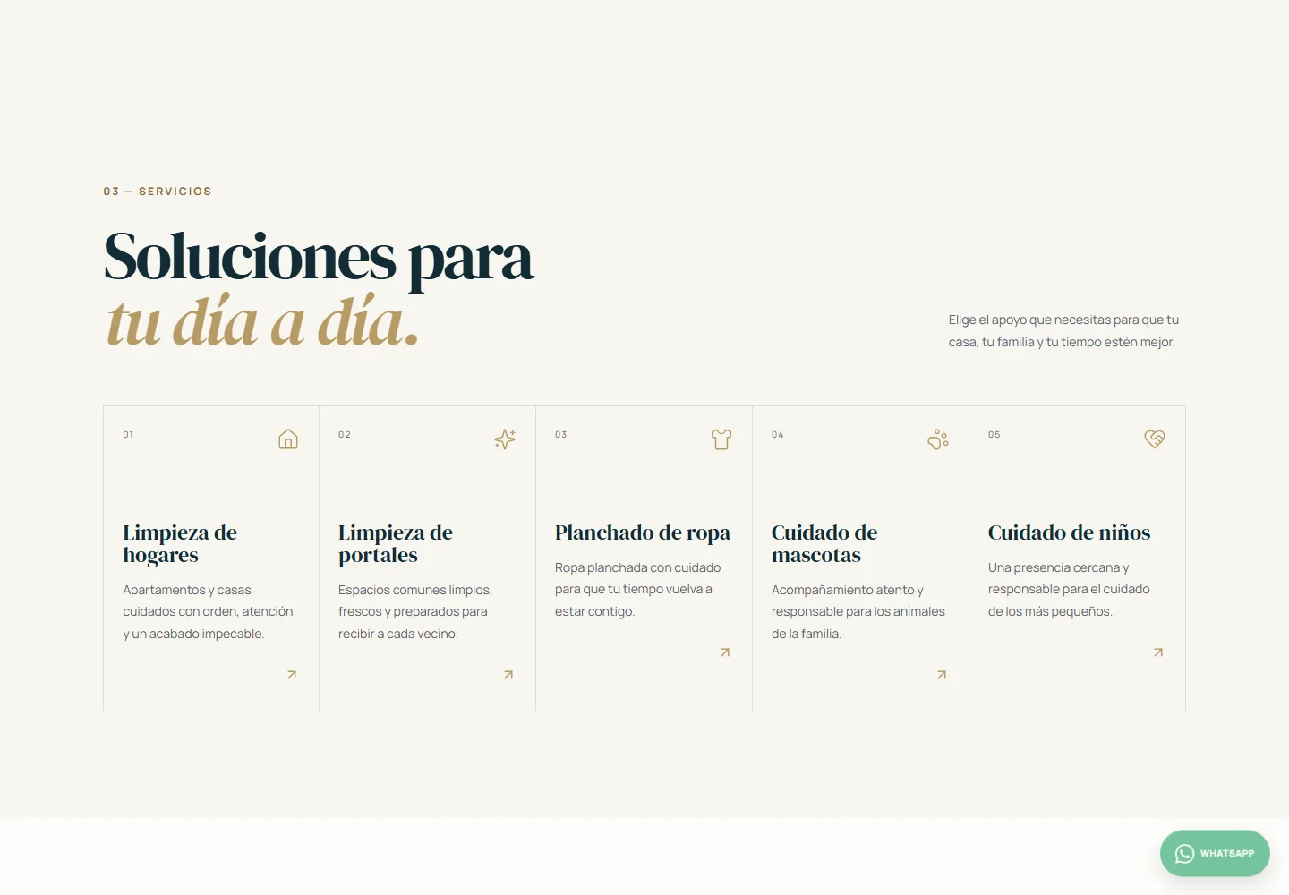
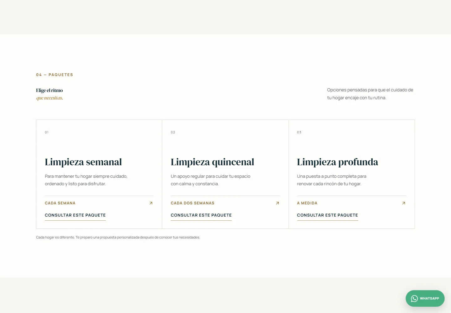
There is no single contact button: every section has its own, with a pre-written message specific to that context.
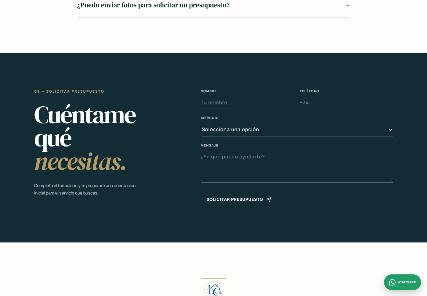
A short, transparent section on what to expect at each visit, with an honest invitation: share your own home's before-and-after over WhatsApp, not generic stock photos.
The site has a real public testimonial system, with a moderation panel behind it.
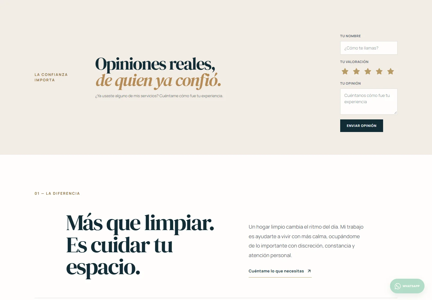
At the time of this capture, production had no public testimonials yet — the form exists and works, but no review had been submitted and approved yet. Every submission arrives pending; it's only published once Luciane approves it from the admin panel.
React 19 · TypeScript · Vite 7 · Tailwind CSS 4 · Cloudflare Pages · Cloudflare Pages Functions · Cloudflare KV.
The same page reorganizes into a single column, with the main menu turning into a sliding panel.
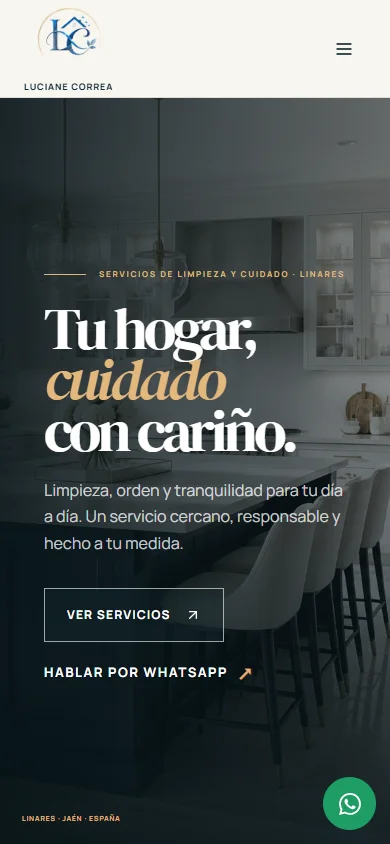
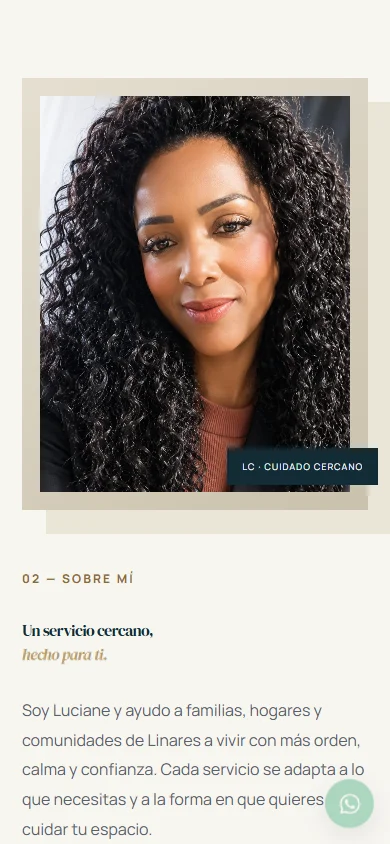
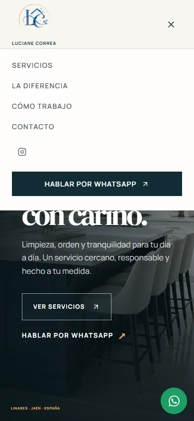
Real screenshots of the published production, at 390px wide.
The site is live and the implementation is real, but this case does not claim business impact: there are no documented metrics for leads, sales, conversion uplift or search growth. The testimonials section describes the system as it is, without inventing reviews that do not yet exist.
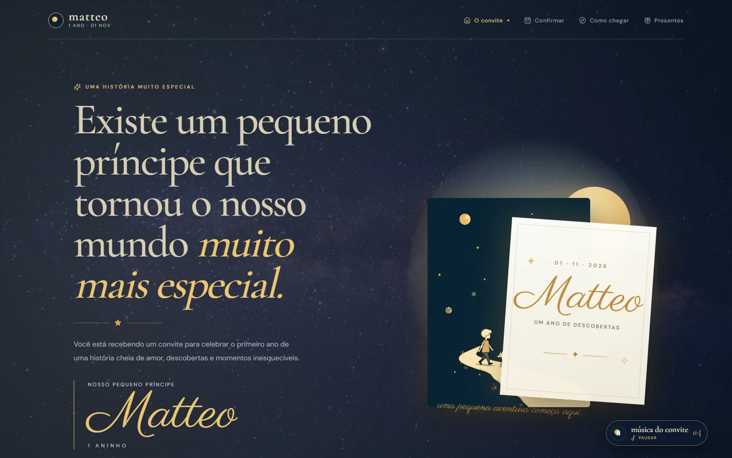
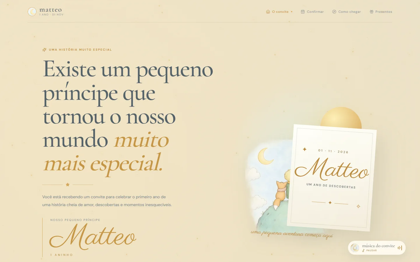
A birthday invitation that evolved into a multi-page digital experience: a scene that changes with the visitor's local time, a countdown, attendance confirmation and gift suggestions.
A birthday invitation that evolved into an interactive, multi-page digital experience, combining visual storytelling, a dynamic atmosphere, interaction and a responsive experience.
The starting point was a birthday invitation meant to be shared by message. The idea evolved into a complete digital experience: a link that opens into a small interactive journey, not a single image.
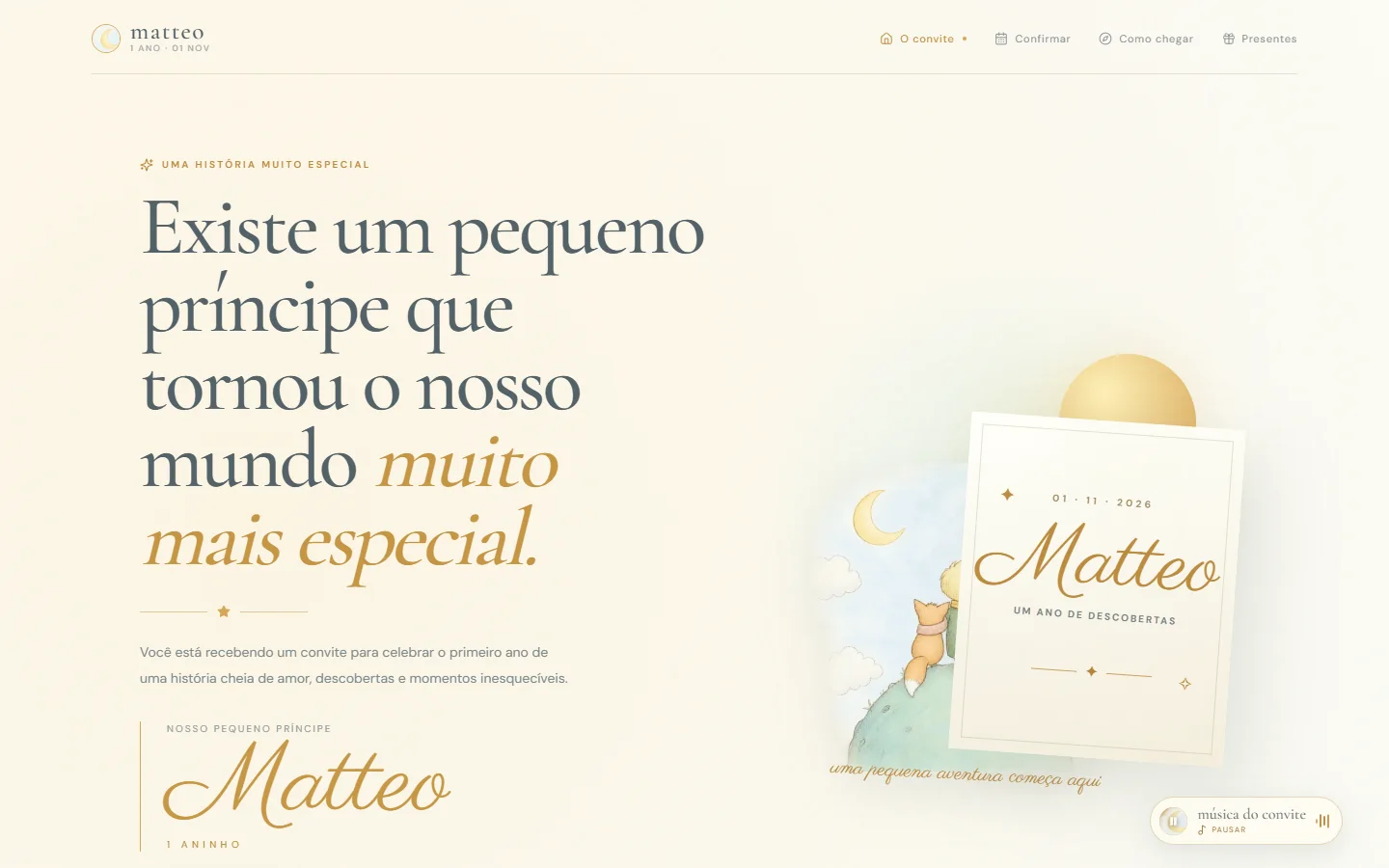
The page's atmosphere changes according to the visitor's local time: day, dusk and night each have their own palette, light and illustrations — it isn't a fixed decorative effect, it's computed on every visit.
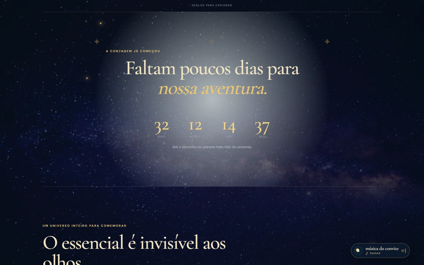
The page has layers of narrative: a real countdown, an opening quote and an invitation to tap into small details of the story.
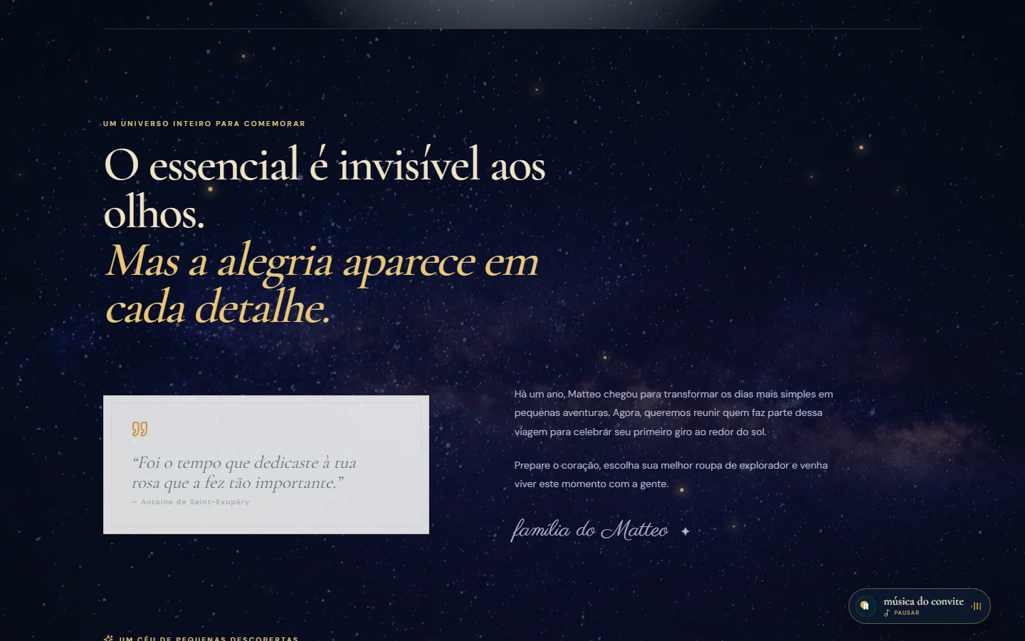
The same illustrations follow the atmosphere change, in versions of their own for day and night, reinforcing the experience's visual identity.
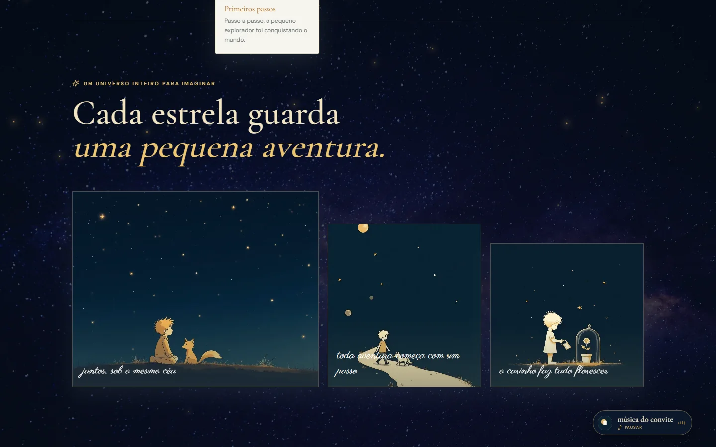
The visual universe is inspired by 'The Little Prince', by Antoine de Saint-Exupéry: its characters and motifs appear as a thematic reference, without implying affiliation, licensing or ownership by x7rG.
Three dedicated routes extend the experience: attendance confirmation, directions and gift suggestions — real functionality, not decorative screenshots.
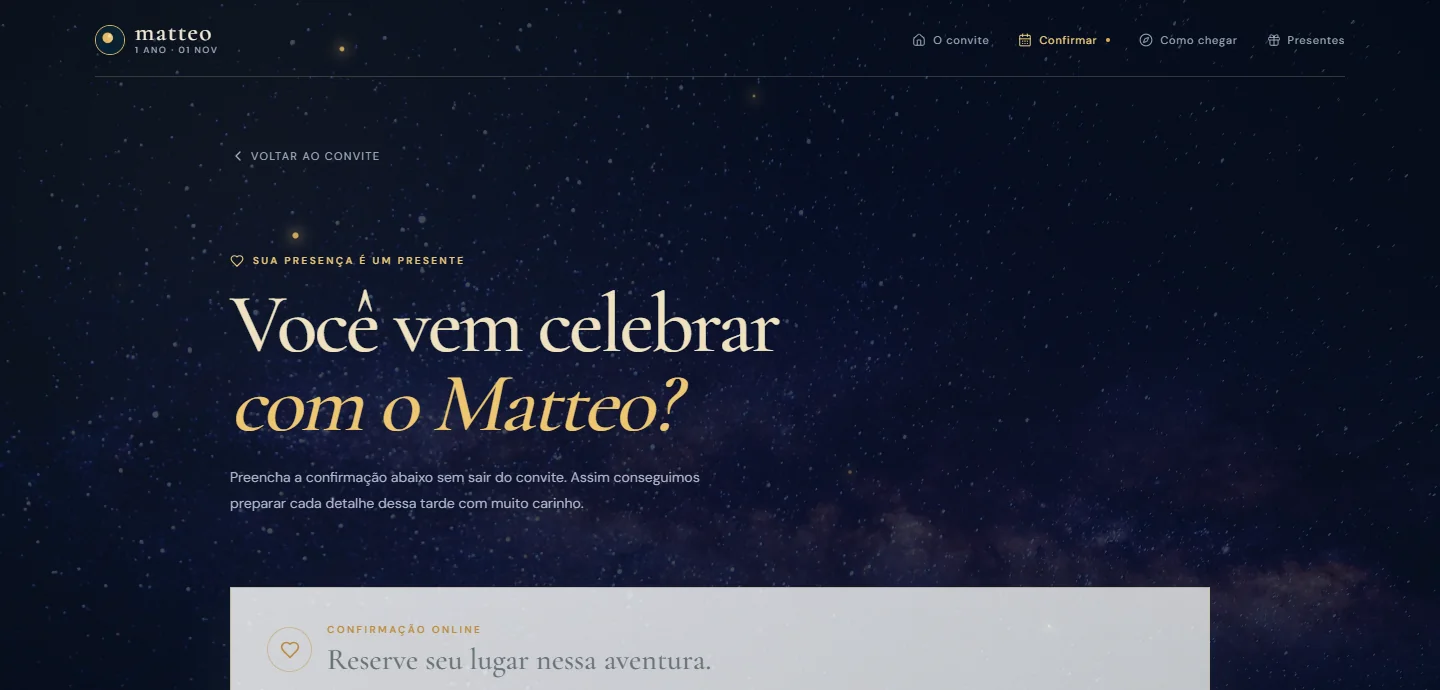

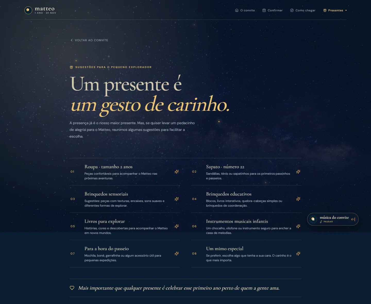
React 19 · TypeScript · Vite 7 · Tailwind CSS 4 · Google Forms · Google Maps · YouTube (embedded music).
The main navigation becomes a sliding panel and the four routes stay fixed in a bottom bar — a deliberate reorganization, not a scaled-down desktop.
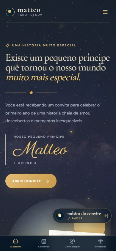
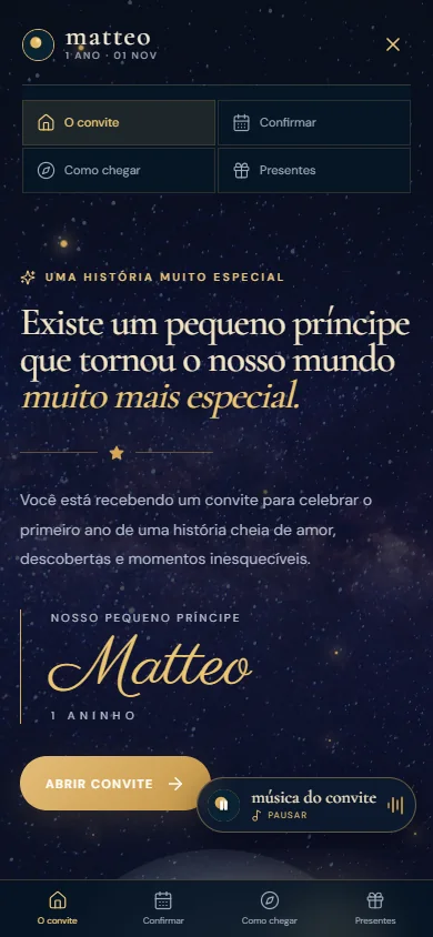
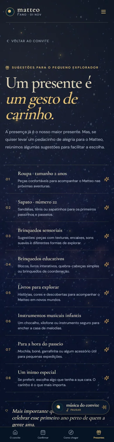
The same function, reorganized for touch — not just scaled down.
For privacy, this case does not reproduce the live attendance-confirmation form, the event's exact map, or any data from the Pix distance-gift system (key, recipient name or QR code). These features are described, not shown in their real state.
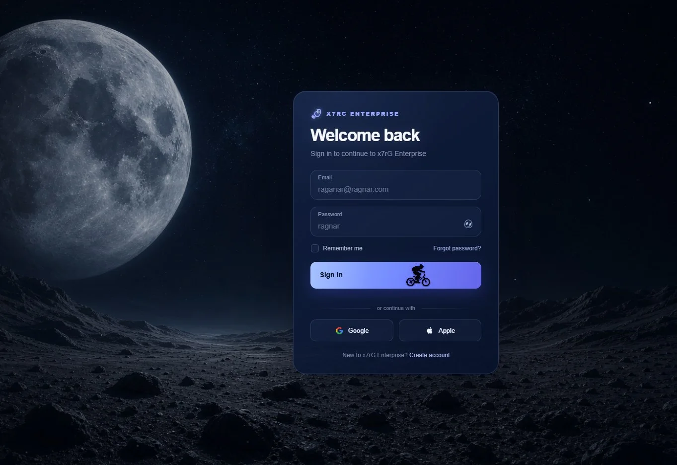
A login screen turned into a small space story: a lunar scene, an animated landing and a card that reacts to the pointer.
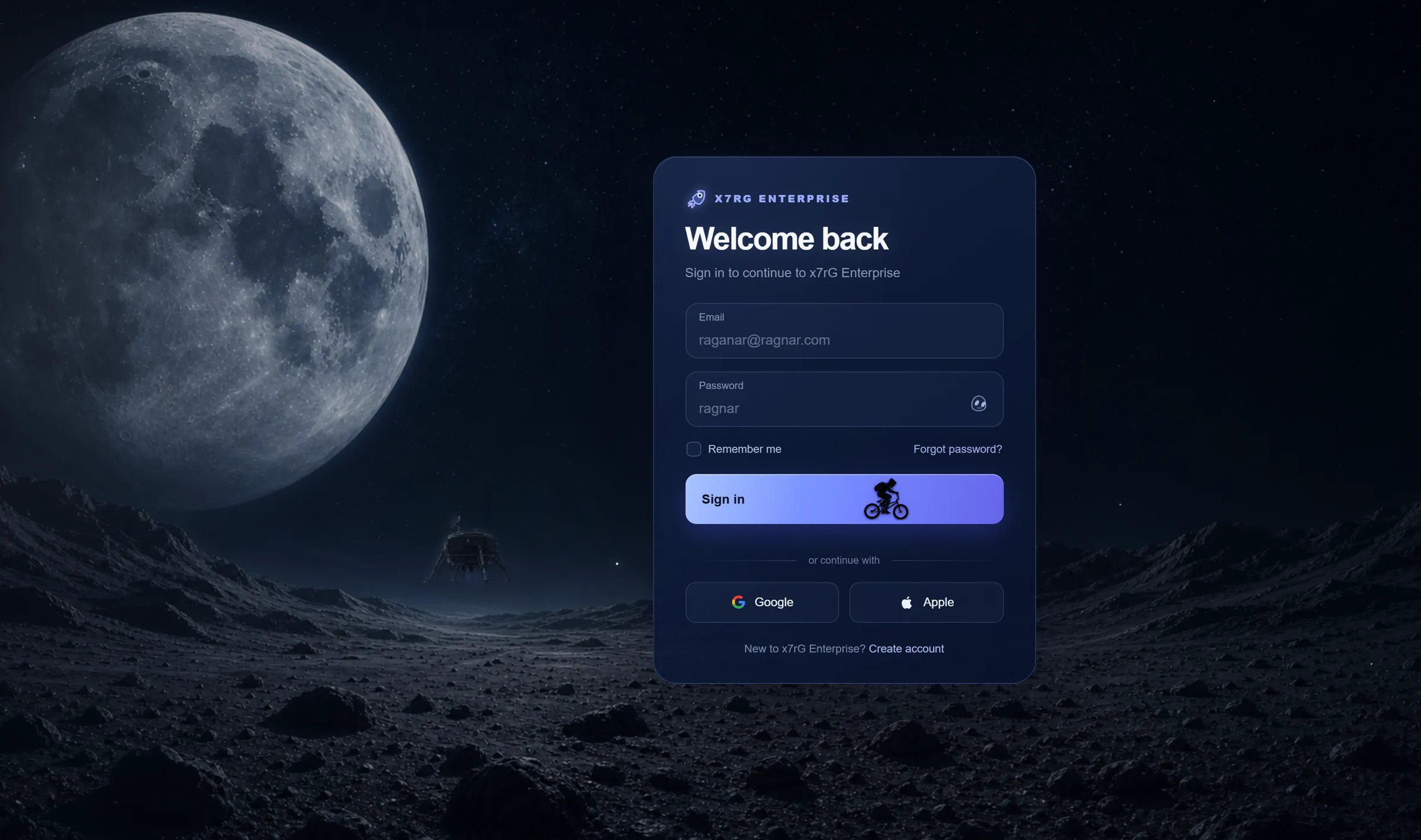
A login screen that stages an arrival: a lunar module descends, dust rises and the sign-in button becomes part of the scene.
Capture of the published project. The app’s interface is in English.
Two gestures, two responses. The first touch anywhere on the page starts the lander’s descent; submitting the form takes 3.6 s and ends in “Access granted”.
6.4 s descent
Any click or tap on the page unlocks audio and starts the landing: the lander begins to descend 0.6 s later and takes 6.4 s. It happens once per visit.
3.6 s
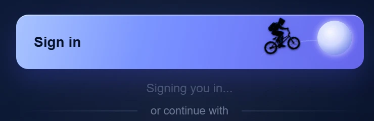
With email and password filled in, the button enters loading for 3.6 s, the activation sequence plays and a bicycle crosses the button.
final state
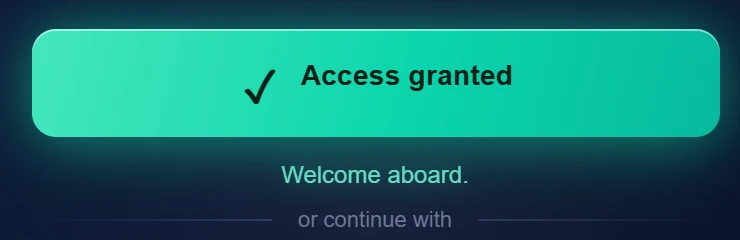
The button turns green, the text changes to “Welcome aboard.” and the lander finishes landing in its own time. There is no redirect: the arrival is the end.
It is not a video: the lander is an image placed over the scene and moved by CSS, with thrusters, dust and shadow on the same clock.
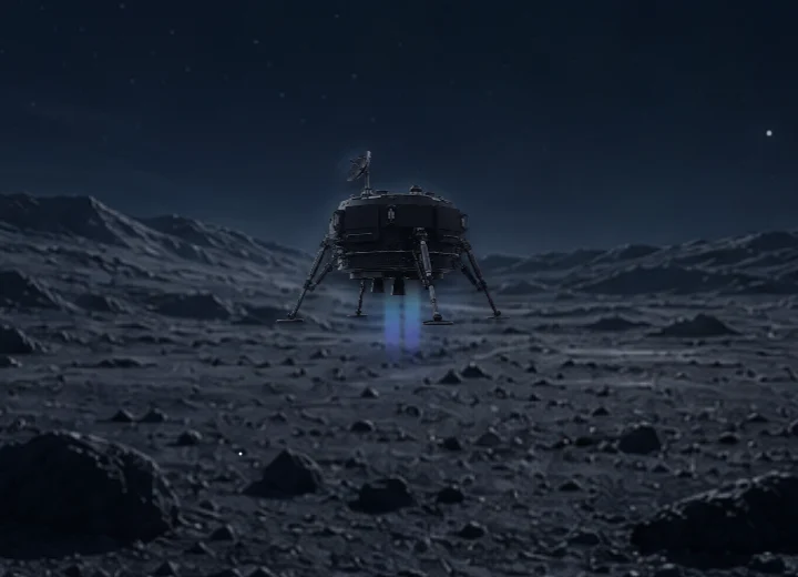
+1.2 s
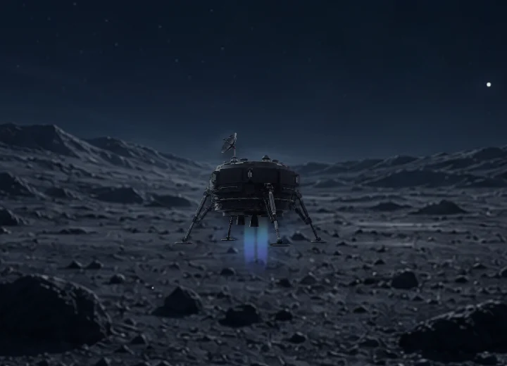
+2.1 s
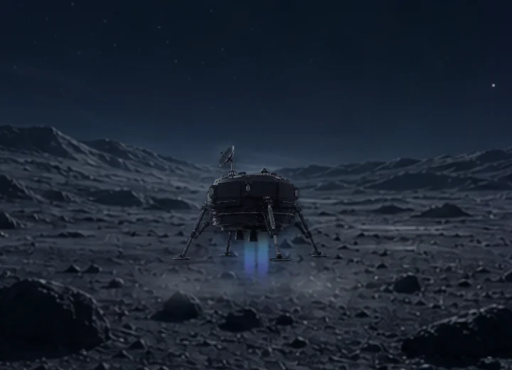
+3.0 s
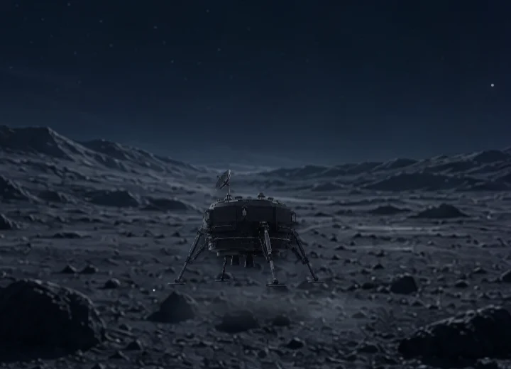
+4.6 s
Four frames of the same recording, cropped around the lander. Times count from the first touch.
The lander, two thrusters, the engine glow, two dust layers, five smoke layers, two dust waves and the shadow run on a single 6.4 s clock and switch on with one class, is-activated.
The sign-in button does more than confirm. During the 3.6 s wait a bicycle crosses it towards a lunar glow, and the result arrives as the button’s own state.
Idle
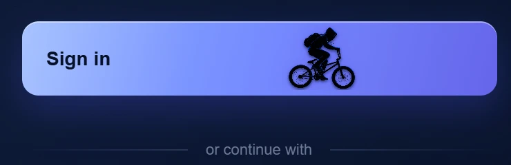
Sending
Access
The bicycle silhouette is an AI-generated image, shown on the button at natural size. The previous silhouette, taken from the internet, was removed from the project.
The audio is not a file: it is synthesised in the browser with the Web Audio API, in two sequences, one for each gesture. The bars show, in seconds, what the code schedules.
Image
Sound
Image
Sound
Listen to the two sequences
Samples rendered with the app’s own audio code, with the volume normalised. Nothing plays on its own.
Next.js 16 and React 19, TypeScript 5, exported as a static site; custom CSS (Tailwind is imported but does not draw the interface) and Web Audio. Published on GitHub Pages and Cloudflare Workers.
The card fills the screen width and the scene recedes into the background. Both captures are the real 390 × 844 state, the project’s own layout.
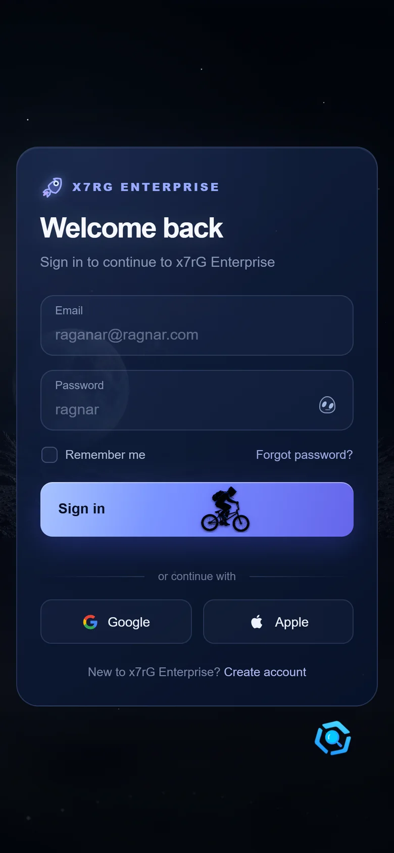
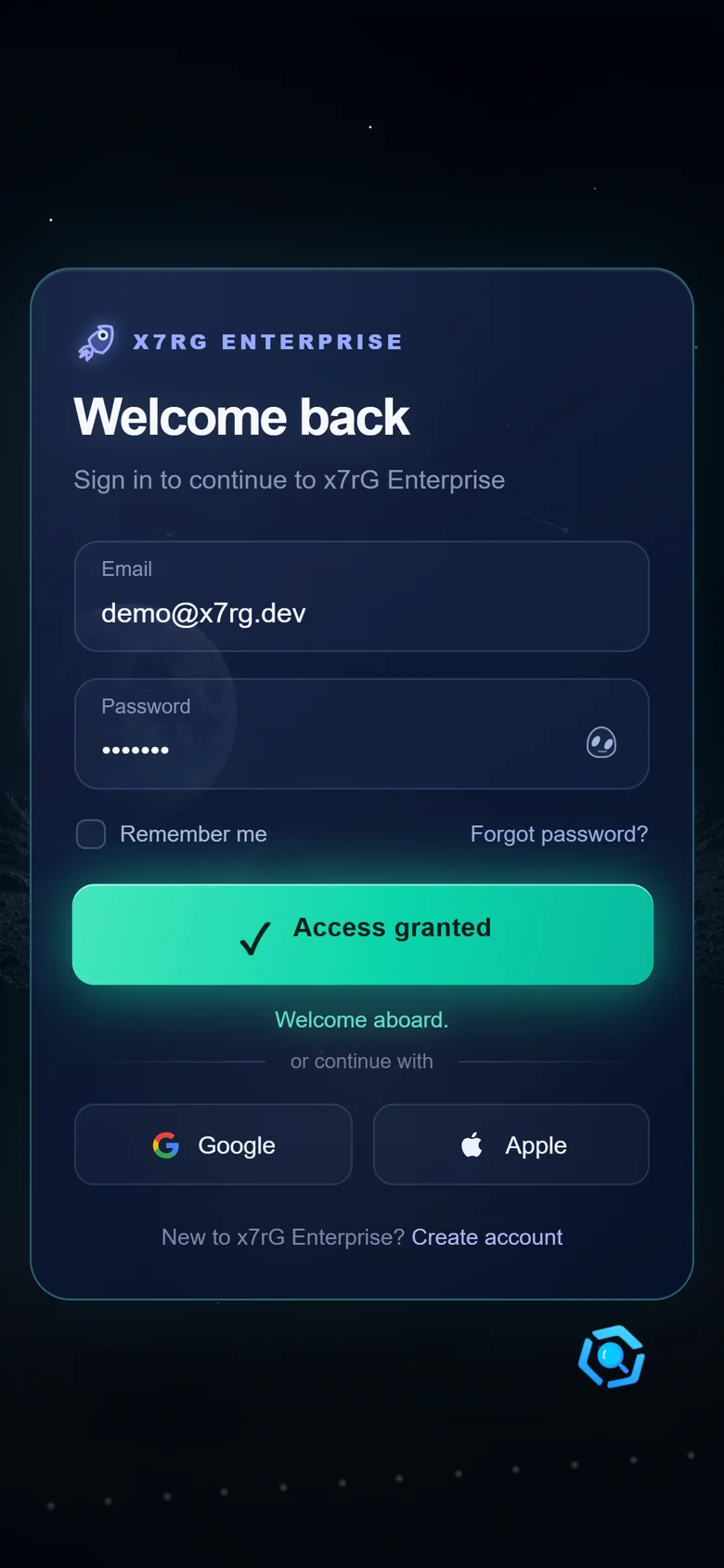
Real captures of the published project.
It is an interface experiment, not an authentication system. Any email with a filled password triggers the demonstration: there are no accounts, server, session or validation. Google, Apple, password recovery and account creation are visual elements that only show a message (“ready to connect”); no integration exists.
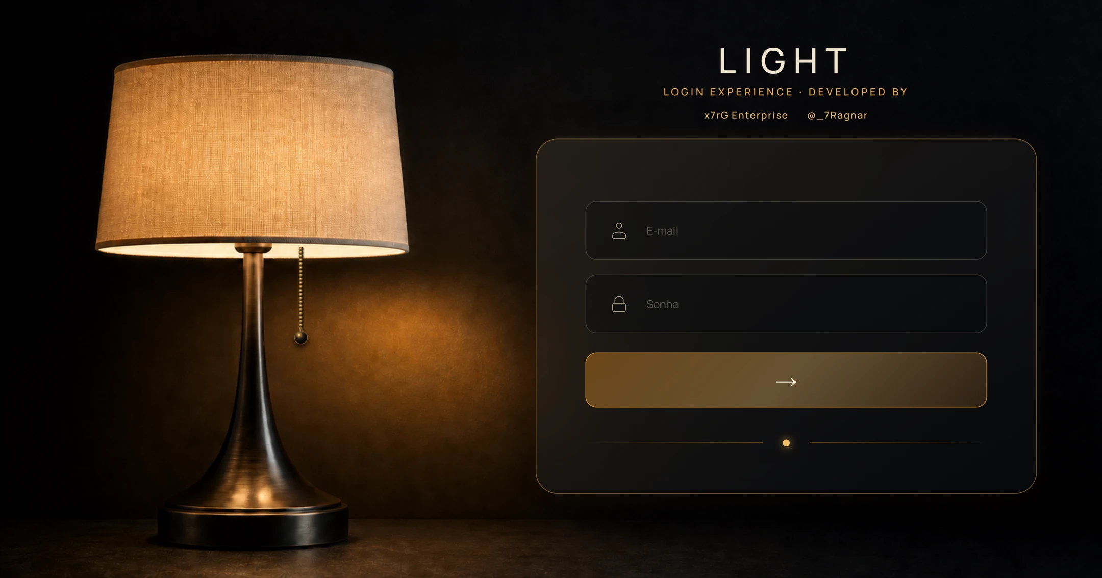
A login screen where light controls the interface: an interactive lamp, the swing of its cord and audio generated in the browser.
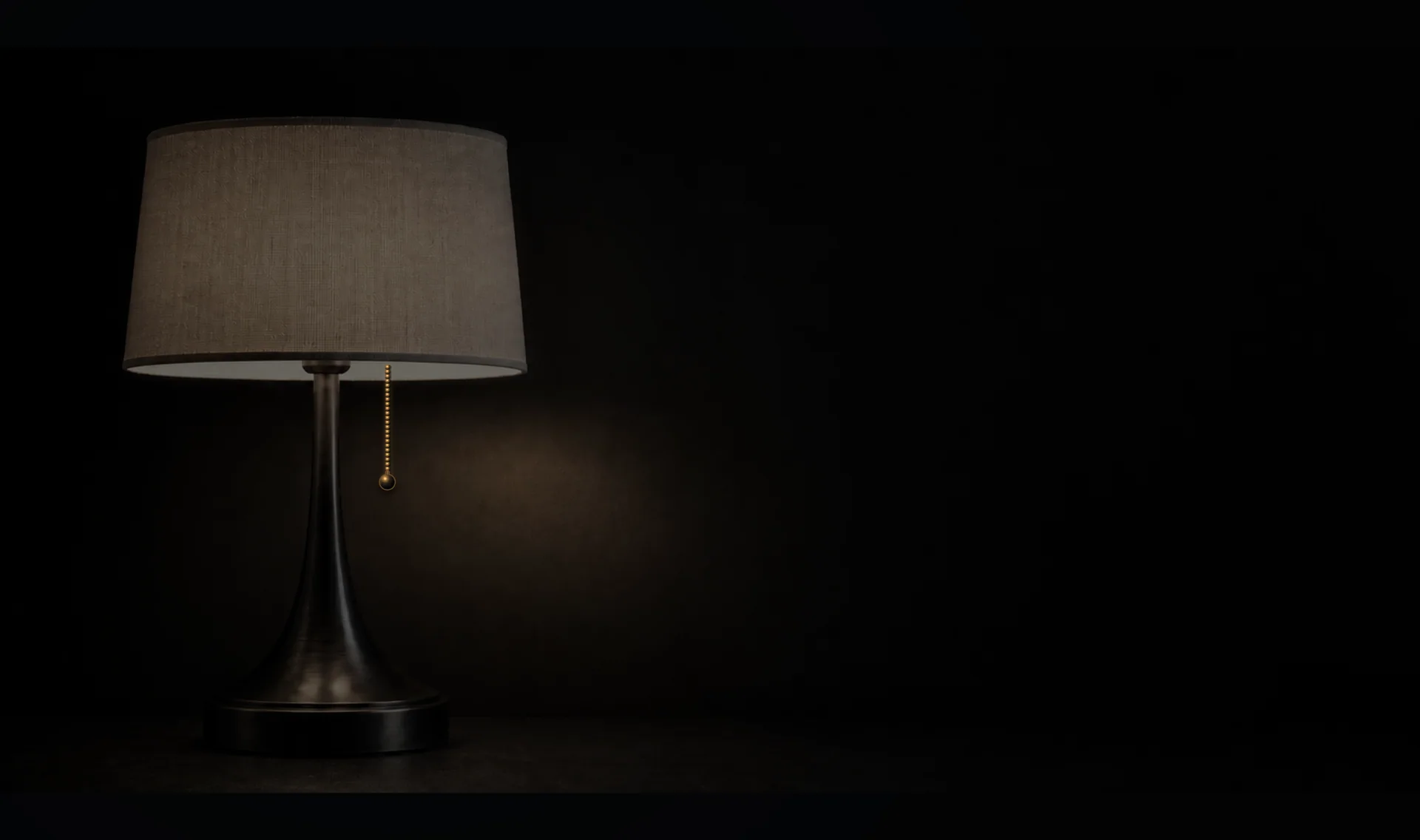
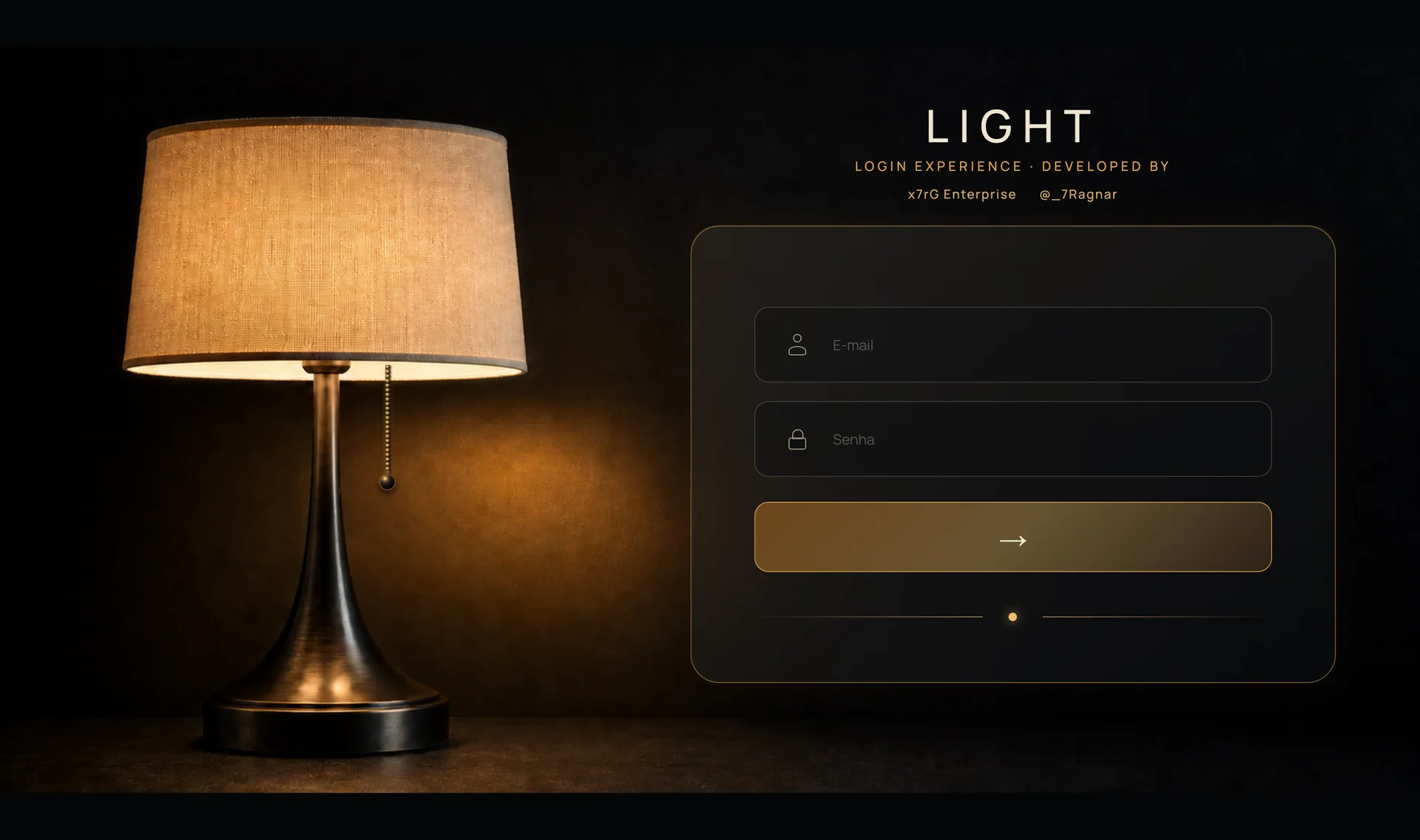
When the lamp turns on, the form appears. When it turns off, the form leaves the screen and the keyboard: the light is the state of the interface.
The same cord answers in two ways, and 4 pixels of movement decide which.

Only the horizontal and vertical displacement from the pivot matter, the point the cord hangs from.
angle = asin(displacement ÷ resting length), with the angle capped at 38°. Vertical displacement adds up to 16% to the length.
They become two CSS variables, --chain-angle and --chain-length, that turn and stretch the same element without recreating it.
With more than 4 px of movement it was a drag: the cord returns and the light stays. With 4 px or less it was a click: the light toggles.
With the light off, the form does not just get dark: it leaves the Tab order, leaves the accessibility tree and stops receiving touches. Turning the light on brings it all back.
Light on
Light off
Tab stops in the project, with the names the app itself uses, in Portuguese.
aria-pressedaria-hiddentabIndex = -1role="status"It is an interface experiment. No credentials are sent or stored and there is no authentication: the form only uses the browser's validation (a valid email, a password of at least 6 characters) and shows “Acesso realizado.” for any valid pair.
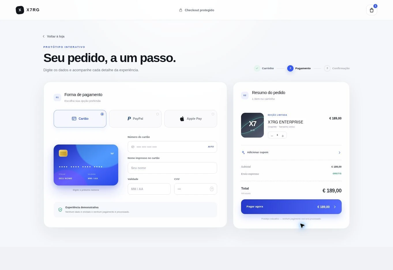
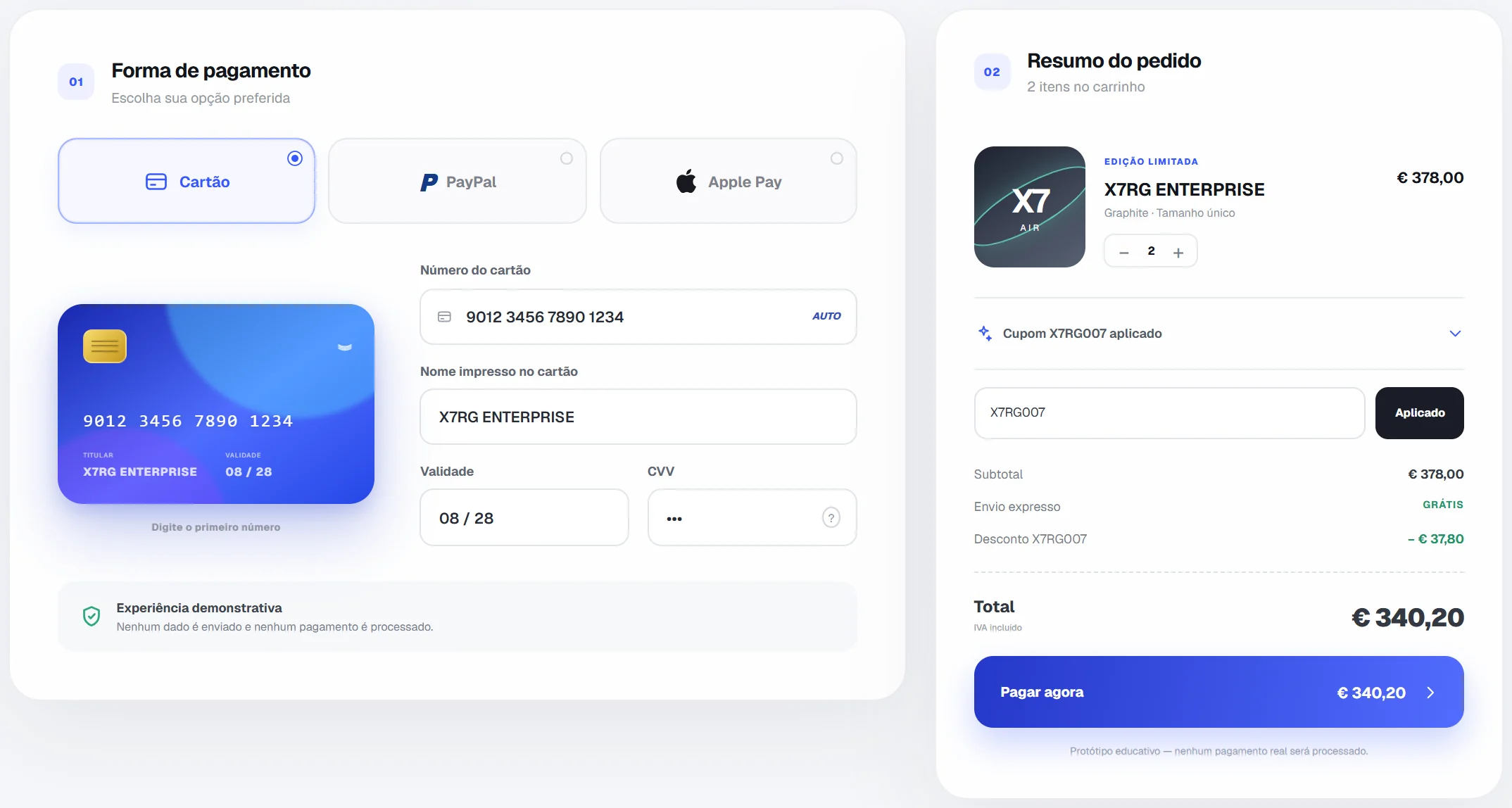
An educational checkout prototype, responsive and interactive, to study React, TypeScript, CSS 3D and animation. It does not process payments.
A checkout where the card is the interface: it reads the form as you type, flips to show the CVV and follows the order through to the receipt. A study prototype, not a payment system.
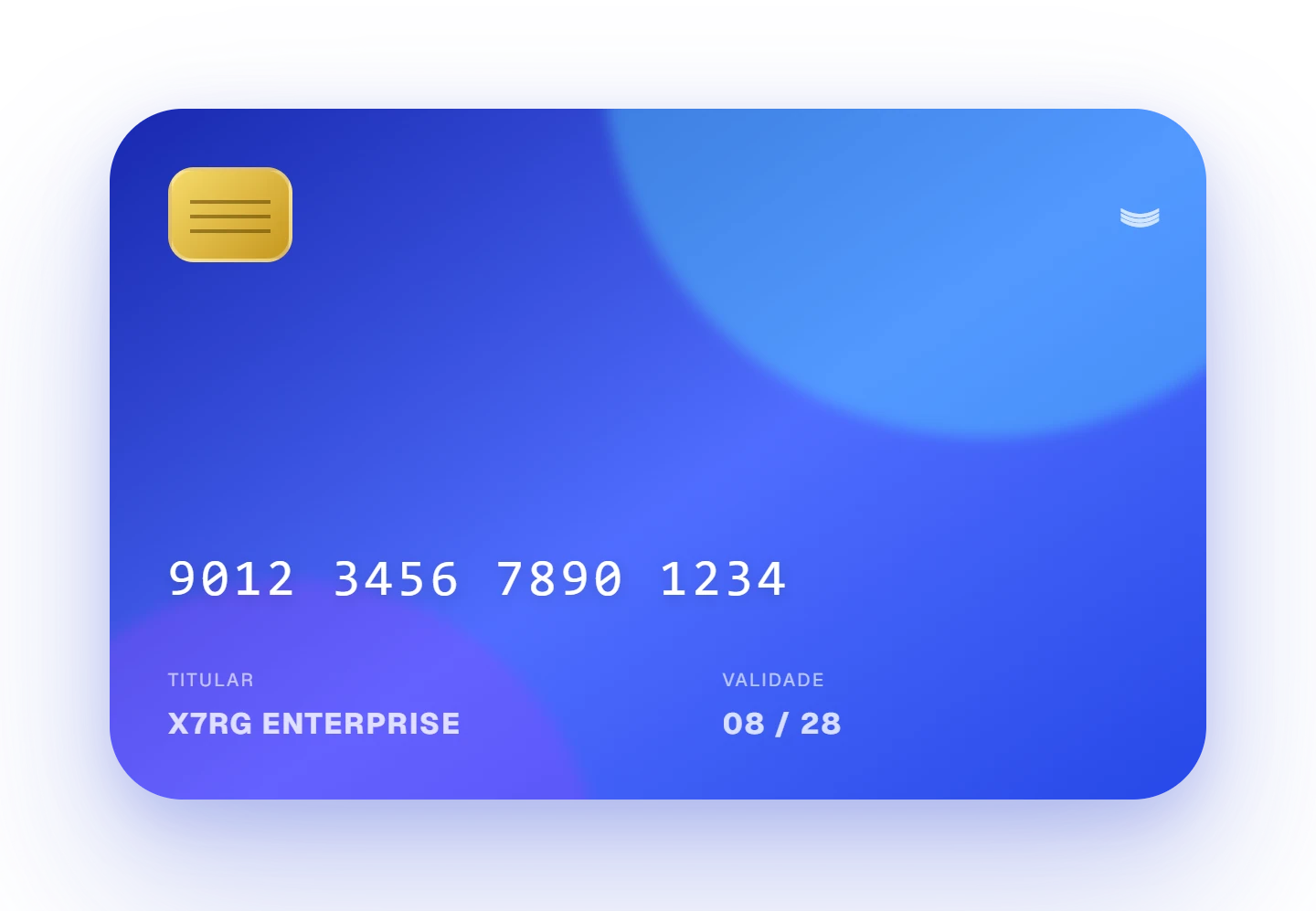
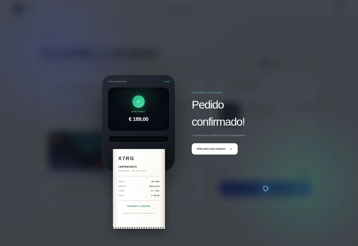
Real captures of the published prototype, with the interface in Portuguese. The card and the data are demo data.
Every field has a place on the card, and the card shows only what the form holds: nothing on it is decorative.
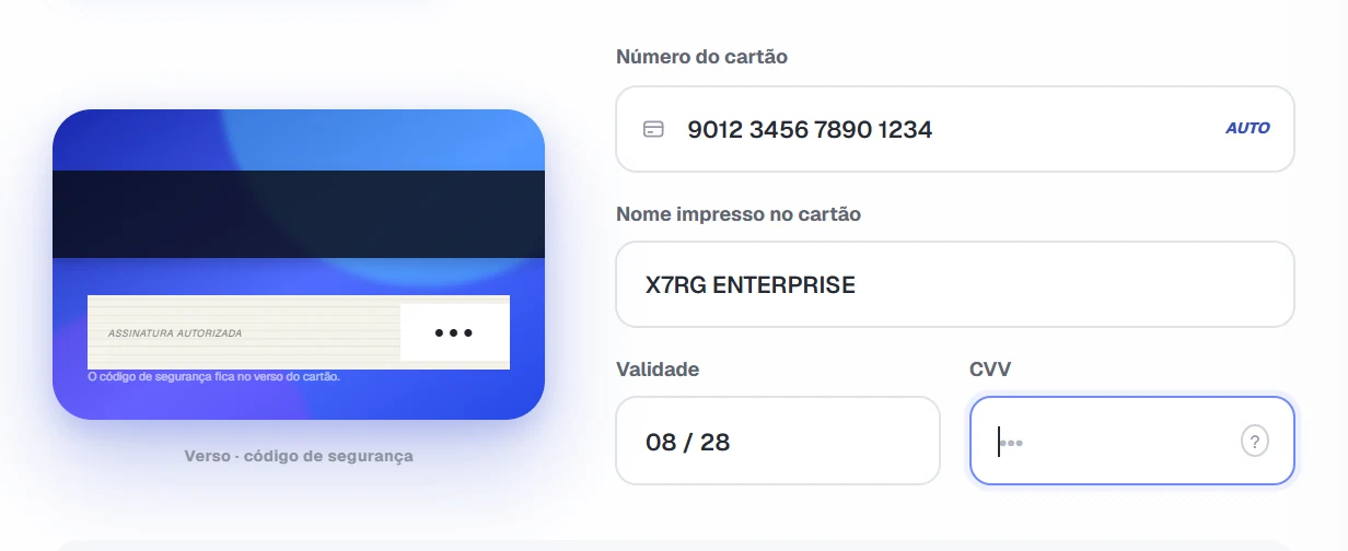
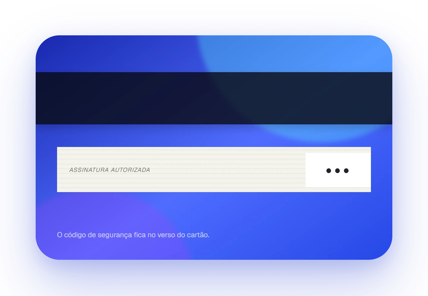
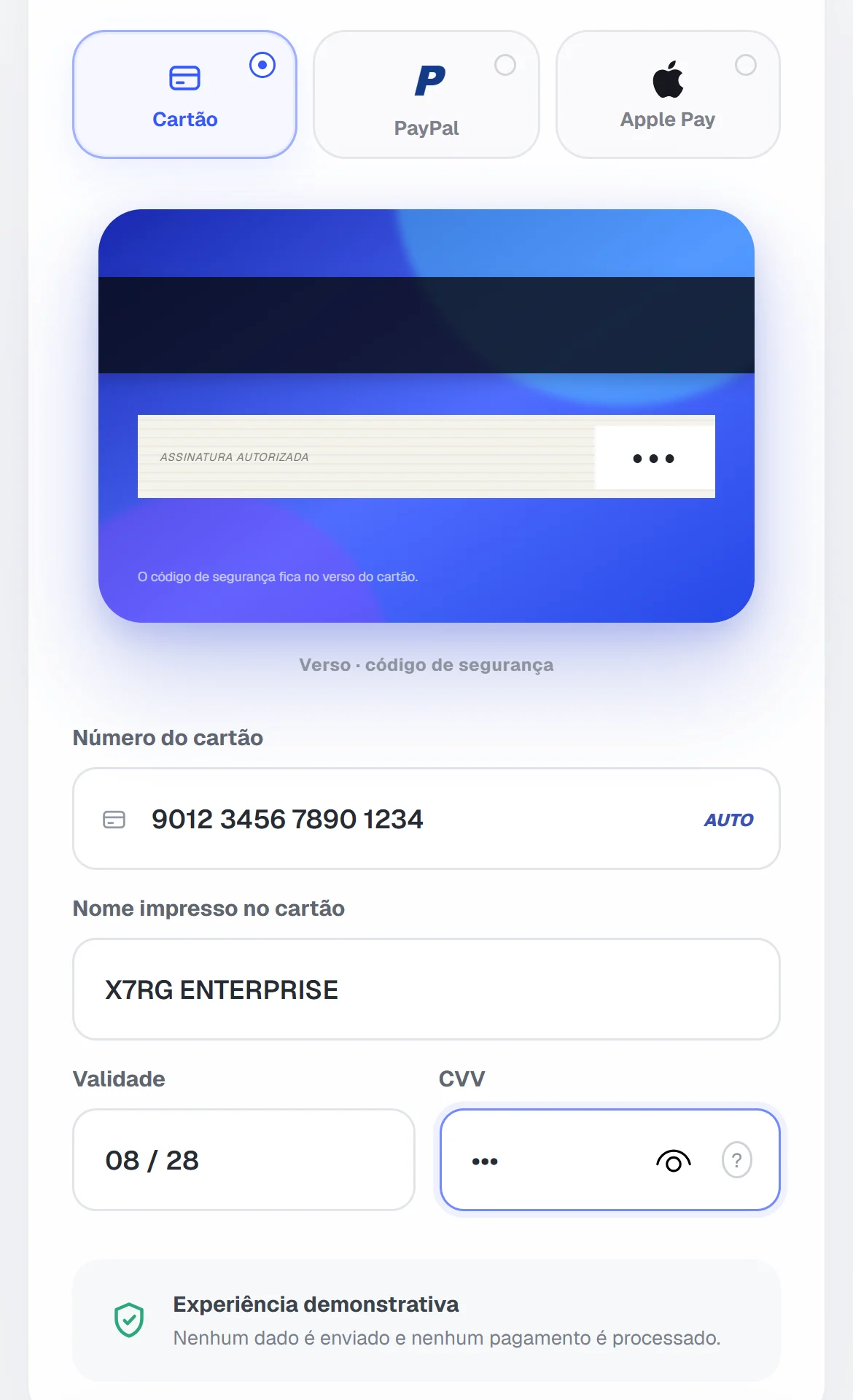
The brand follows a simplified teaching rule based on the first digit, from 1 to 8. It is not real card-brand detection or issuer validation.
Quantity (1 to 5), coupon and total come from the same React state. The test coupon X7RG007 gives a 10% demo discount, and the recalculated total returns on the Pay button and on the receipt.
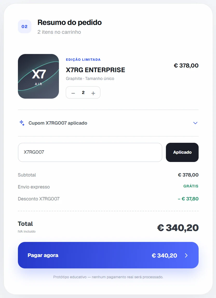
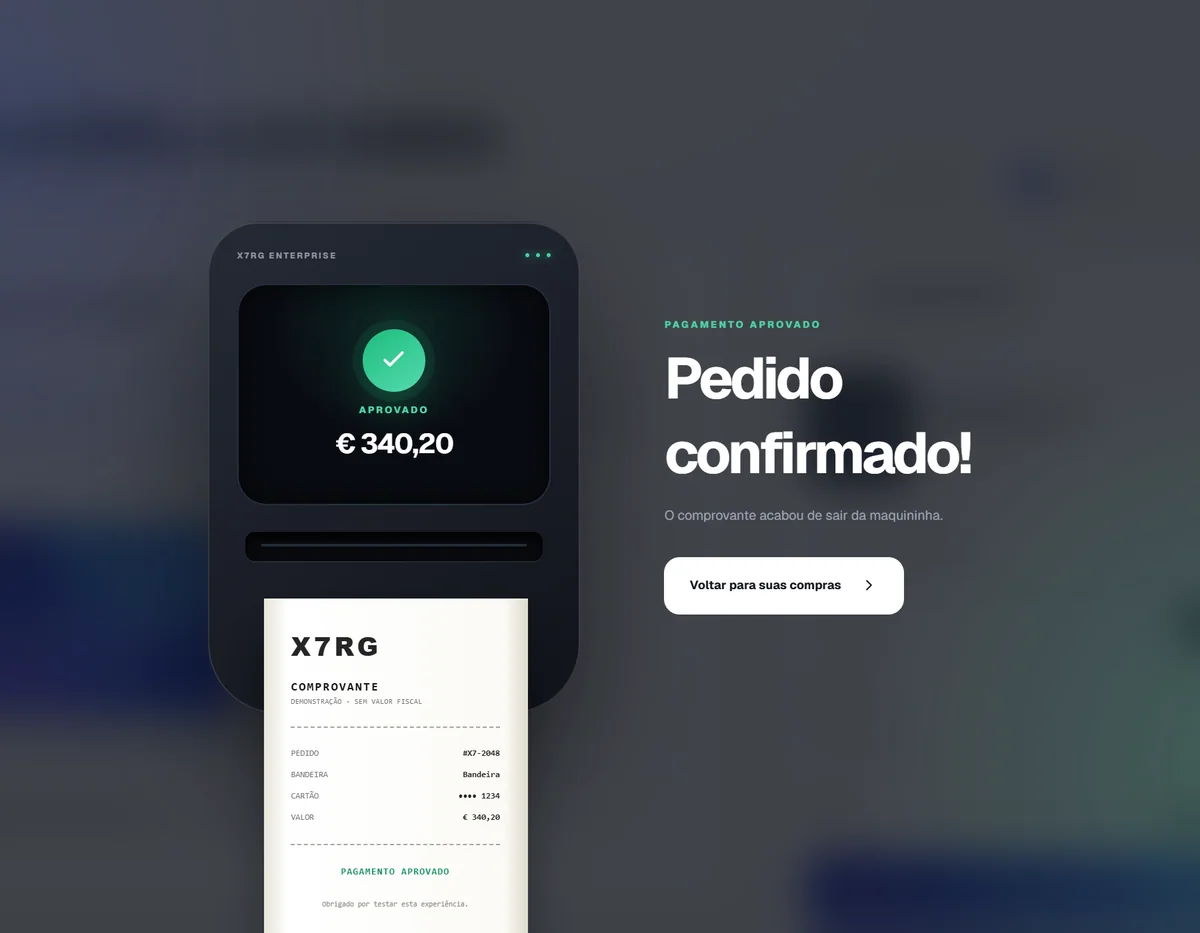
Paying takes the overlay through three states. The receipt is the end of the flow, not the subject of the project.
idleThe ordinary page, with the form and the summary.
processingFor 2.7 s, the card floats over a blurred background.
approvedThe terminal shows the amount and prints a receipt with no fiscal value.
focusednumberquantity, discountpaymentStateThe flip is CSS only: a scene with 1100 px of perspective, two faces in preserve-3d and a 0.72 s transition to rotateY(180deg), switched on by a class.
React 19.2.6 and TypeScript 5.9, Vite 8 and CSS (3D and keyframes). Published as static files on GitHub Pages and Cloudflare Workers.
It is a study prototype. It does not process payments, does not send or store card data and does not validate cards: it only checks that fields are filled and their length. PayPal and Apple Pay are visual tabs, with no integration. The brands are illustrative and do not imply any affiliation. Atmosphere text in the interface, such as “Checkout protegido”, does not mean payment security. The receipt has no fiscal value.
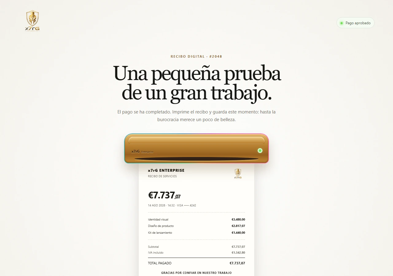
A thermal printer that prints a demo receipt, in the browser and with no data back end.
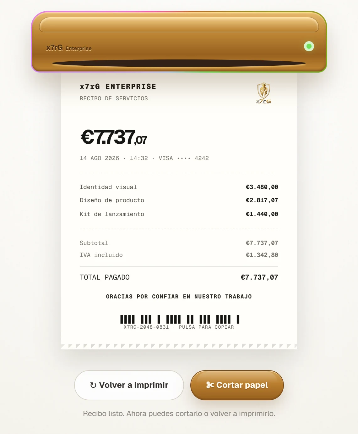
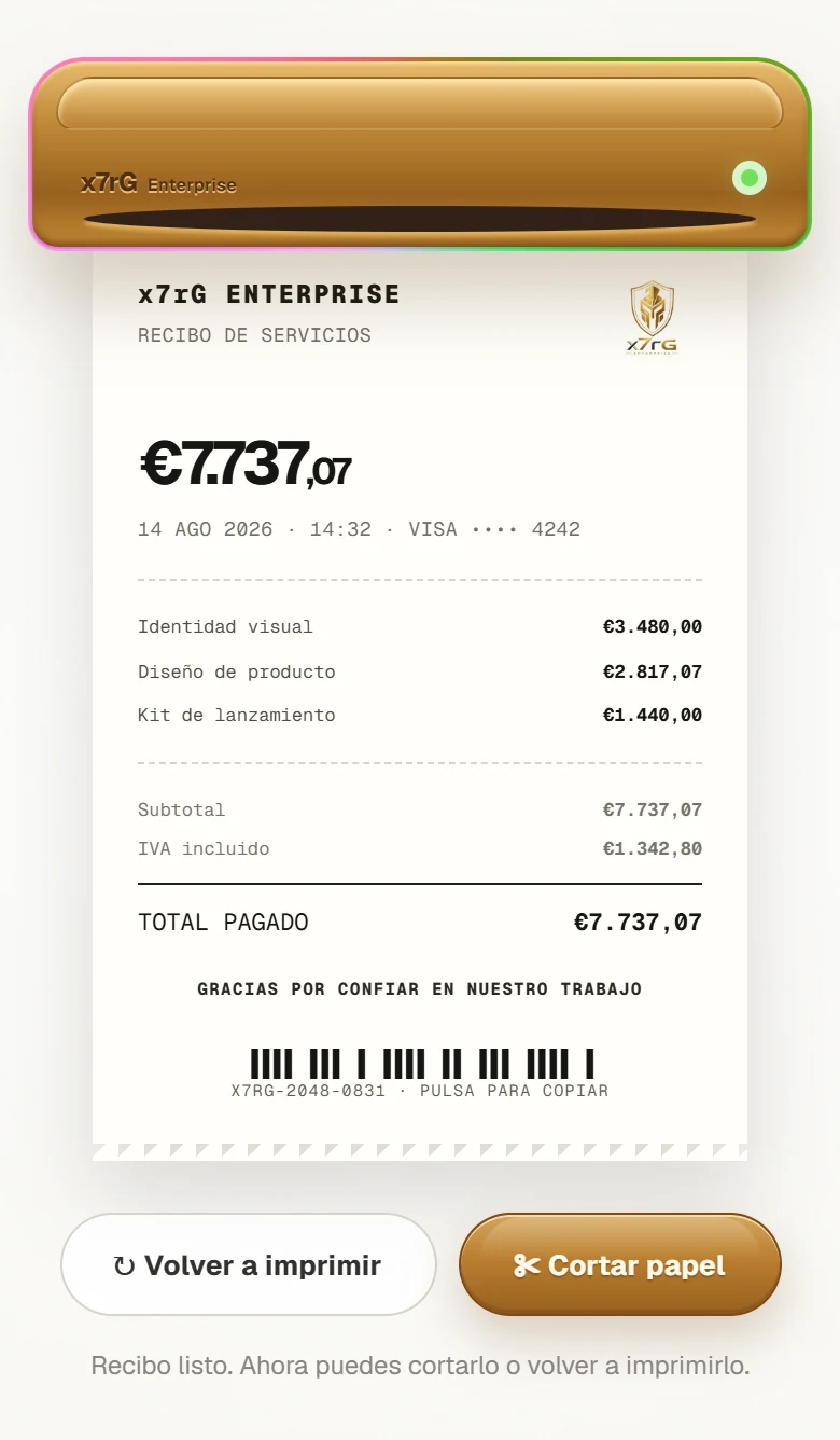
An approved payment usually ends as a line of text. This project asks whether a digital confirmation can keep some of the ritual of receiving a printed receipt: the machine starts, the paper comes out, a signal says it is done.
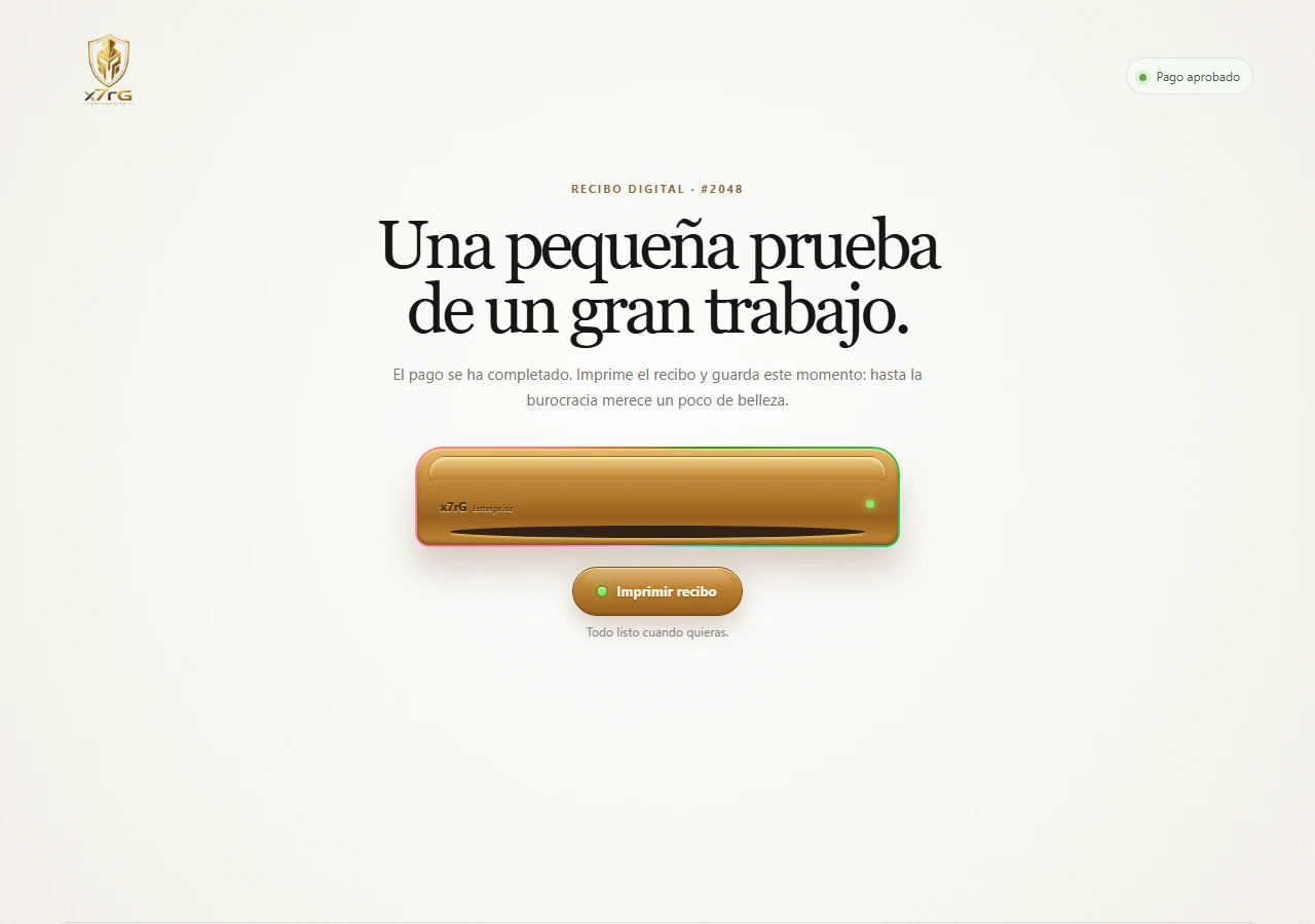
The visitor never changes screens: the printer moves through four states, and everything you see or hear depends on which one is active.
idlestarting point
printingclick on Print
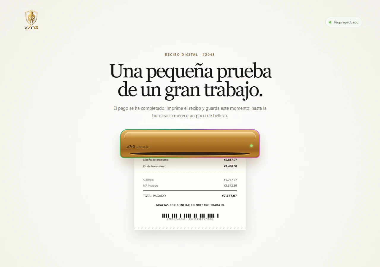
ready1.9 s later
tornclick on Cut
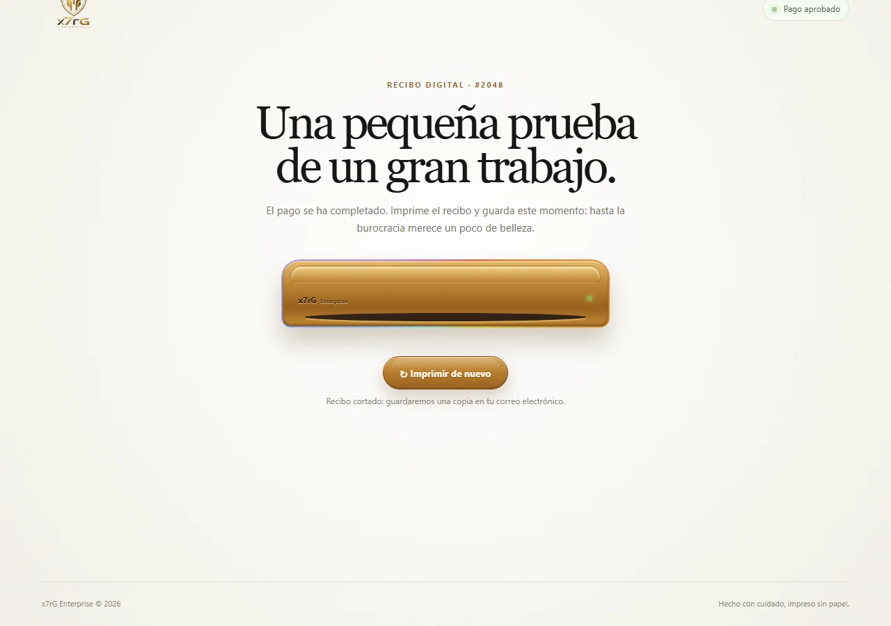
From “ready” and from “torn off” you can print again, and the cycle restarts.
None of these outputs animates on its own: they all read the same state, so nothing drifts out of sync.
This is the interaction that makes sense of the rest, and a still image cannot show it. The recording is of the real experience, with no sound.
Imprimir recibo: the click starts the printer sound and the state becomes printing.
The paper descends through the slot while the LED blinks and the neon intensifies.
The state becomes ready and the chime sounds at the same instant. The buttons become Cut and Print again.
Cut leads to the torn state: the paper falls away and disappears.
The printer is a recording made by Rogério, 1.9 s long, the same length as the paper animation. The chime is synthesized in the browser with Web Audio, as two tones (880 Hz and 1318.5 Hz).
Sound only plays when you press a button.
A single state value in React becomes a class on the machine. The CSS reads that class for the paper, the LEDs, the neon, the buttons and the helper text. Nothing animates on its own, so nothing drifts out of sync.
The printer recording is loaded as soon as the page opens. The audio context is created on the click, because browsers only allow sound after a gesture from the visitor. The chime comes from the same transition that leads to the ready state.
The receipt is clipped by the machine's window and moves only with translate3d, a GPU-accelerated transform chosen to keep the motion stable in WebKit browsers such as the iPhone's.
There is no database and no data back end. The only server code is the Worker that delivers the page.
It is an interface demo. The receipt's amounts, date and card are fictional: nothing is charged, emailed or stored, and the receipt has no fiscal value. The starting idea, using less paper when a digital receipt is enough, is only motivation: the project measures no savings at all.
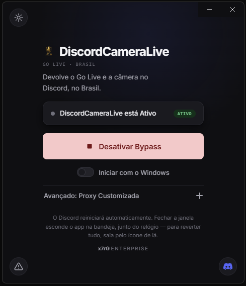
GoLiveBypass adaptation to restore Go Live and camera access in Discord.
DiscordCameraLive is a fork of GoLiveBypass. This case separates what came from the original project from what x7rG modified and maintains.
GoLiveBypass was created by bezumiya. DiscordCameraLive starts from its version 1.1.5 and keeps the GPL-3.0-or-later license.
Established by diffing against the original’s version 1.1.5. The plugin and the Go API stay as in the original; the work is in the desktop application, delivery and documentation.
Equicord/Vencord plugin
Inherited
The logic is the original’s. In the fork, the plugin name and the about text changed.
Go API (bug reports)
Inherited
Inherited. Only names and the target repository were changed.
Electron interface
Inherited + x7rG
The interface comes from the original. x7rG hardened it: nodeIntegration off, context isolation and sandbox on, preload through contextBridge and a Content-Security-Policy in the HTML.
The app.asar swap
x7rG
The swap stopped deleting before writing: the new content is prepared in a temporary folder, the current app.asar moves to a rollback name and only then does the new one go in, with a way back if anything fails.
IPC inputs
x7rG
The proxy address coming from the interface is validated (type and a 512-character limit) and the window-height request has a 1200 cap.
Name, brand and installers
Inherited + x7rG
Installers and standalone are inherited. The project was renamed in code, texts and scripts, and the icon and logo became an x7rG emblem, with the x7rG Enterprise banner.
Continuous integration
x7rG
CI on every push and pull request: builds the interface, checks that the embedded copy of the bypass has not diverged, runs vet and the API tests and the shell tests; plus a weekly Dependabot.
Documentation and delivery
x7rG
README split into five guides, SECURITY.md and a step-by-step for beginners; release v1.1.5 with a Windows executable, a Linux AppImage and a macOS dmg/zip.
The program enables the bypass by swapping the app.asar of the Discord installation (the original becomes _app.asar). The change was in the order of operations.
- nodeIntegration: true,- contextIsolation: false,+ nodeIntegration: false,+ contextIsolation: true,+ sandbox: true,Real lines from the electron/main.ts diff against the original’s v1.1.5. The diagram is the portfolio’s.
I start from what already exists: a WhatsApp group, a PDF, a childhood memory. Then I design and build what’s missing.
I'm Rogério Gomes, creator of x7rG ENTERPRISE. I work across technology, design and product, turning problems, needs and ideas into digital experiences.
Not every project starts from a formal specification. Some start with a real operational need, an inefficient process, an interface that could work better, or an idea worth exploring. My role is to give that idea direction and turn it into something that can be seen, used and tested.
I take part in the whole process, not just one stage of it:
Code and design aren't isolated stages. They're part of the same construction process.
Artificial intelligence is also part of that process. I use AI as a tool to develop, explore alternatives, produce certain assets and speed up iteration — while keeping direction of the project and being clear about its part in the result.
The background is cross-disciplinary: visual design, systems development, technology management and technical systems.
Artificialintelligencehasbecomeoneoftoday'sleadingtechnologicaltoolsandatransformativeforceintheeconomyandsociety.Itsevolutionalreadyshapesproductivity,thejobmarket,howcompaniesandprofessionalscreatesolutions,anddifferentaspectsofpeople'slives.
In the end, every project in this portfolio is that: an idea that found direction, shape and real use.
From rG to x7rG.

I've always liked being called by my full name: Rogério Gomes. To me, a name has always carried identity.
Many of the people I've admired throughout my life were also known by their own name and by what they built with it. Among them, Steven Paul Jobs has always been a reference for his journey of overcoming hardship, entrepreneurship and resilience.
My first identity was born from exactly that.
rGRogério Gomes
A symbol built from my own initials. It was the start of an identity that would keep evolving alongside my ideas and projects.
Over time, rG became x7rG.
Then came ENTERPRISE.
ENTERPRISE
To me, it doesn't just mean a company. It also means initiative: the willingness to take on challenges and turn ideas into real projects.
The identity then gained a new symbol: the shield.

I've always identified with Viking and Spartan imagery — not for the warrior figure itself, but for what it represents to me:
Fight.Persistence.Loyalty.
The shield became a visual representation of those principles and joined the x7rG ENTERPRISE identity.
The identity evolved.The origin stayed the same.
Rogério Gomes.
Some companies that were part of my journey.
Experiences, teams, and challenges that also helped shape the professional I am today.













Professional growth is a continuous process. This is where I gather the studies, specializations and credentials that support the technical and creative work in this portfolio — documentation as evidence, not as a showcase.
Archive being expanded
This section presents a selection of my education and credentials. Additional diplomas, certifications and completed courses will be added progressively.
Universidade Salgado de Oliveira — UNIVERSO
Design
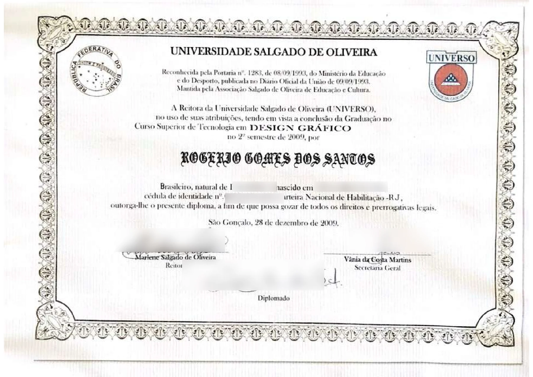
Some personal information has been blurred in this public copy to protect the holder's privacy.
x7rG ENTERPRISE
Good ideas deserve to leave the page.
If there's a project, a problem worth solving, or an idea worth building, we can start with a conversation.
Rogério GomesCreator of x7rG ENTERPRISE